| Author | Thread |
|
|
04/20/2006 06:40:08 AM |
::: Critique Club ::: [The Saj]
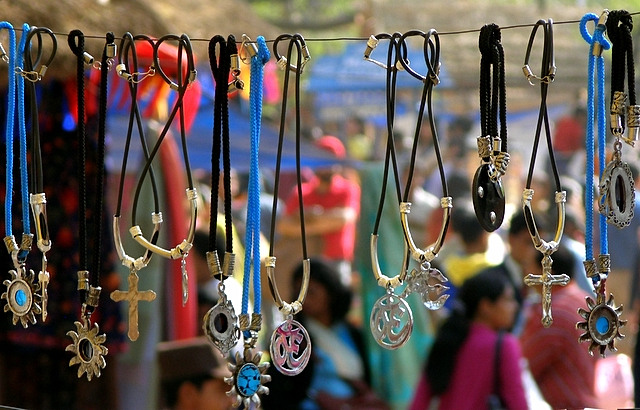
First Impressions: Colorful and festive
-------------------------------------------------------------
Composition: Composition is a bit mixed on this one. I feel that the crop creates a several minor distracting elements. On the bottom left we see a white line on dark but no context. Likewise a weird white blotch in the bottom right corner. Now I could understand such minor inclusions had it been for the purpose of including the lowest hanging pendent, but this appears to be cut off. So then I am left asking why you didn't crop it either slightly higher or slightly lower, as either choice would have benefited the shot. Likewise, I'd have expanded the borders to each side a millimeter or two just to include the entirety of the pendants and not clip off miniscule amounts. I might have however cropped a tiny bit of the top/top left portion.
The other element that kinda puts me off a little to this photo is the background. It's just very noisy. Maybe if it was blurred just a little bit more. Though if the intention was to include the people in the background then it was nicely blurred.
Subject: The subject is interesting and well captured but I'm not sure it conveys much emotionalism. It's a photo of a vendor's rack. A nice photo but not the most stand out subject.
Technical (Colour, focus, and light): Color is very strong and diverse in this shot and I think that is one of this photos stronger elements. The focus and lighting is also strong. You did do a good job of focusing on the foreground and blurring the background to nicely create two layers of depth.
-------------------------------------------------------------
To improve?: Be mindful on your crop and try not to cut off edged of elements. Or if you go that route, at least ensure that you remove distracting artifacts/elements.
Not sure if it were possible, but if you were able to change the angle so that all the background was of the lighter tone. (As opposed to it being much darker on the left) It might make for a less distracting background element. But this may very well not have been possible. Just something to keep in mind.
Summary: Not a bad photo, not bad at all. But the subject matter does lack some punch. However, if I was a vendor and wanted to display my wares on the web or in print, you've done an excellent job of capturing.
-------------------------------------------------------------
It is my hope that these insights are helpful, and constructive. If you have any questions regarding this critique, please feel free to PM me. Also feel free to PM me with any feedback on this critique. And please remember to mark it "Helpful" if you found it so.
- Jason "The Saj"
|
|
 Photographer found comment helpful. Photographer found comment helpful. |
Comments Made During the Challenge  |
|
|
04/18/2006 06:46:26 AM |
| Like the vibrant colors and good DOF of field in this shot. |
|
|
|
04/18/2006 12:56:12 AM |
| Good colours and depth of field. |
|
| Photographer found comment helpful. |
|
|
04/17/2006 04:54:14 PM |
| very original idea. good composition |
|
| Photographer found comment helpful. |
|
|
04/17/2006 03:20:53 PM |
| I like the vibrant colors here and the softness of the background. |
|
| Photographer found comment helpful. |
|
|
04/13/2006 12:08:07 PM |
| The background is so busy that the charms get lost. They are the last thing I notice, and yet are the subject of the shot. |
|
| Photographer found comment helpful. |
|
|
04/12/2006 01:05:17 PM |
| Cute title and colorful image |
|
| Photographer found comment helpful. |
|
|
04/12/2006 09:28:27 AM |
| Nice display and colors. It's probably more gold, silver, etc. than chrome, which might cost a point. Background is distracting, try your fastest lens at largest aperture to blur out the background more. |
|
| Photographer found comment helpful. |
|
|
04/12/2006 07:47:41 AM |
| Very good idea,the colors and shapes of the necklaces adds a lot of interest. IMO the back ground adds to much clutter. |
|
| Photographer found comment helpful. |
|
|
04/11/2006 08:48:41 PM |
| background is too in focus....try using a larger apature (lower fstop) to blur the background more. This will focus more on the subject. The background is so busy and colourful it makes it hard to look at and destracts from the subjects. |
|
| Photographer found comment helpful. |
Home -
Challenges -
Community -
League -
Photos -
Cameras -
Lenses -
Learn -
Help -
Terms of Use -
Privacy -
Top ^
DPChallenge, and website content and design, Copyright © 2001-2025 Challenging Technologies, LLC.
All digital photo copyrights belong to the photographers and may not be used without permission.
Current Server Time: 04/09/2025 03:09:27 PM EDT.