Greetings from the Critique Club!
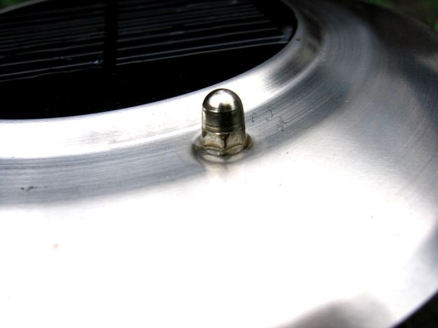
In looking at this image, I have to admit I find it hard to find a lot of visual appeal to it. The screw is dead center, and it would be a little more powerful if the surrounding texture was free of blemishes. The overall contrast is OK, but this does not pop. There is just not much power in the image.
This may sound like I am dropping the hammer on this image, but I assure you I am not. I have a deja vu sense looking at it, and I realize it is because I have taken many just like it - I saw something in an abstract pattern that looked interesting, but had trouble making it come to life in the image as seen through the lens. The best I could offer in terms of how to make this image better would be to re-evaluate it yourself. Are you truly happy with it? Aside from the challenge and the score I mean - is it something you think is particularly powerful as an image? If it is, then more power to you - we can't all see things the same way, nor should we want to. But if the answer is no, you know as much, and probably more than I do - revisit the composition and lighting or move on to a fresh subject.
For what it is worth, I think your abstract image of a leaf (your highest rated photo currently) was very underrated in that challenge. I like that one a lot.
Sincerely,
Rich. |