| Author | Thread |
Comments Made During the Challenge  |
|
|
04/17/2006 05:57:09 PM |
|
|
|
04/14/2006 12:36:19 PM |
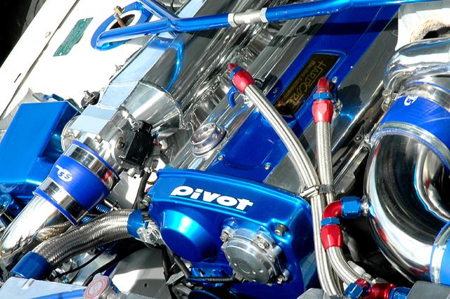
| I think it's a little too busy. It's too much to take in, and that big patch of over-exposed white in the top left is really distracting. I think it would be better if you took a tighter crop to give it more focus. I like the colours, though. It's a great contrast between the masses of blue, and the little red thingies. (not a car guy, sorry, don't know the names for them.) |
|
|
|
04/13/2006 10:54:34 PM |
| Good shot. It's a bit hot towards the upper right corner. Maybe trying to expose for the harsh highlights, rather than the mid-tones would have gotten the point across a little better? Nice concept though, there's lots of chrome there, for sure. |
|
|
|
04/13/2006 01:30:58 AM |
| The blown highlights blew it for me (no pun intended) |
|
|
|
04/12/2006 12:43:40 PM |
| Looks like a good product shot. Maybe a bit on the glary side, light is a tad harsh, but I can easily imagine this in a product catalog. |
|
|
|
04/12/2006 08:17:24 AM |
| A lot of potential here. Something about it just doesn't feel right in the composition. Top left and right corners are the culprit I think. Certainly is a bunch of chrome in there! ;^) |
|
Home -
Challenges -
Community -
League -
Photos -
Cameras -
Lenses -
Learn -
Help -
Terms of Use -
Privacy -
Top ^
DPChallenge, and website content and design, Copyright © 2001-2025 Challenging Technologies, LLC.
All digital photo copyrights belong to the photographers and may not be used without permission.
Current Server Time: 04/11/2025 04:25:14 PM EDT.