Greetings from the Critique club!!
First Impression - the most important one:
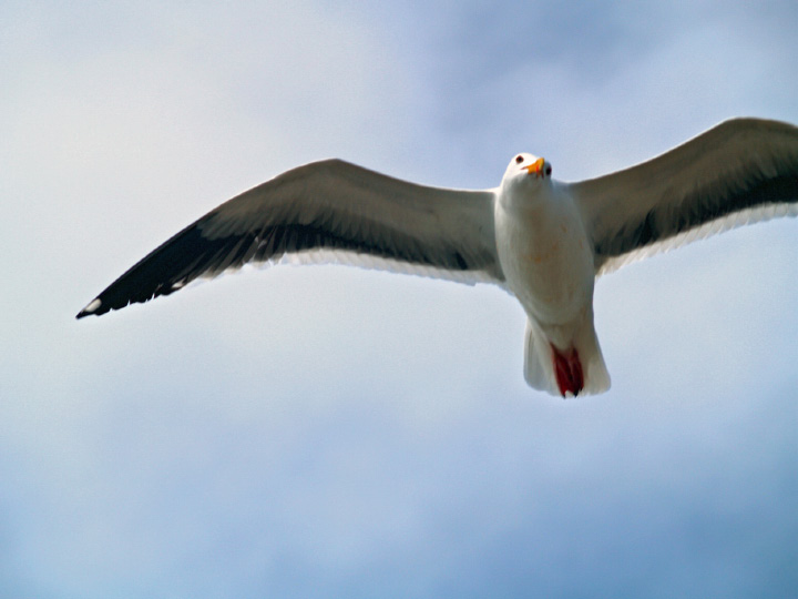
My honest first impression is that this was Close to being a good shot. The colour of the sky is lovely
Composition:
There are composition "Rules" which of course are not rules at all but are a set of reseached and known illustration structures that have been proven to appeal to viewers. This applies to paintings as well as photographs. As 'creative' as we all want to be, these rules appear to have worked for a couple of hundred years and I think we ignore them at our peril.
The main 'rules'
- Rule of Thirds (A): Elements should fall on a thirds line at least and at best on a thirds intersection. In this image,I think the bird sits quite nicely within the rule of thirds
- Viewing Flow (B):Again research has proven that the eye enters an image at the bottom-left corner and transitions to the top-right corner. As you can see with this image there is space and room for the eye to enter and follow the bird to the top-right thirds intersection.
- Leading Lines(B): Leading lines are elements or structures of an image that lead the eye to the Point of Interest (POI). I am missing this, for this image
- Stop Point (C): Another element that can help a composition is in conjuction with Viewing Flow. If you have an element that stops the eye leaving the image out of the top-right corner, then you've added another satisfaction point for the viewer and another reason for them to feel comfortable with and like the image. This is often achieved with a tree framing top and right or a building etc. In this case the size and imposing nature of the wreck superstructure effectively stops the eye from moving on.
The viewer/voter doesn't analyse any of this. The response to the image is totally subjective, that's why these rules work on the subjective, not the rational plane. Here's the graphic of the application of all of these in this pic.
So you can poopoo this whole concept if you feel uncomfortable being constrained by 'rules', certainly may people in DPC do. Certainly any such rules are "... for the adherence of fools and the guidance of wise men ..".
Do these rules by themselves make a great image? I doubt it very much. Can a great image be created without being mindful of these rules. I doubt it very much. Of course there are always exceptions, many amazing images do not conform to the rules but most do.
Subject:
We can't underestimate the value of the emotive impact of the subject. The seagull is a common comfortable familiar subject. But IMHO this may lose points for being a little lacking in creativity
Technical (Colour, focus, and light):
Technically, is where this image suffers. Being entered in the textures challenge the voters would be looking for a texture that really pops. Feathers are a common subject as well here at DPC, and I would think if you are shooting a bird or feathers, they would have to be Over the Top with WOW factor to score big. The softness, slight OOF quality of the image doesn't make the feathers stand out.
- The Light: The lighting is alright for me, it doesnt detract,but it also doesnt add alot to the image
To grow its vote?:
Again, I think it is hard to shot very common images unless they are technically outstanding, or have something new to say. You were stretching to meet the challenge, I would imagine, in the eyes of the DPC voters. The texture was not the thing that stood out here.
I also think a better crop would have helped.
Good Luck in your next challenge!!
texttexttexttexttexttexttexttexttexttexttext |