| Author | Thread |
|
|
04/18/2006 05:00:43 AM |
Critique Club Comment
First let me welcome you to the DPC community.
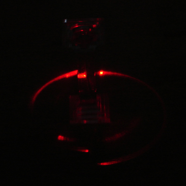
This is the first image that you submitted to DPC, and you have already have learned one important lesson.
If people can’t see what you mean, you will score low.
So your picture must be big enough and bright enough to get the message across.
A good I can give you is to calibrate your monitor.
I don’t know, but maybe your photo looks ok on your monitor because it is very bright, but as you have seen, but the majority of the voters and commenters didn’t see it.
Just google “monitor calibration” and even better, if you are serious about photography, buy a hardware calibration device. That way you ensure that the photos look the same on all calibrated monitors.
Don’t let this low score get to you and try to improve with what you have learned, submit again and see your scores go up. It takes time, it takes effort, but eventually you will get great results.
Looking forward to your next entry.
Peter
|
|
Comments Made During the Challenge  |
|
|
04/11/2006 04:20:01 PM |
| Way too dark. Can't tell what it is. |
|
|
|
04/10/2006 03:31:59 PM |
| Nice red curves, but it's just too dark to figure out. More exposure and a nice range of levels would be better. |
|
|
|
04/08/2006 05:34:18 PM |
| Way too dark for my tastes. |
|
|
|
04/08/2006 02:25:49 AM |
| Too dark to see what you're trying to show us. |
|
|
|
04/07/2006 07:19:02 PM |
This is probably too dark and grainy to do well. This could have been better if perhaps you either brighten the glass or darkened it so that it doesn't show at all.
To brighten the glass I'd suggest using a flashlight and a longer shutter speed so that you can "paint" in some highlights with the flashlight.
To darken it I'd use selective color in PS to bring everything but the brightest reds to black and then maybe a curves adjustment to tweak. Also, that bright spot in the red arc could easily be turned into red to blend in using selective color.
As for the grain any noise reduction filter should improve the refraction arc so that it's smoother and more appealing.
Hope this helps! :) |
|
|
|
04/06/2006 11:17:56 PM |
| Kind of dark to see the refraction. |
|
|
|
04/06/2006 08:27:54 AM |
| Too underexposed to see the refraction. |
|
|
|
04/05/2006 07:56:29 PM |
| This is too dark to make out what we are looking at. A longer exposure would help this out a lot! |
|
|
|
04/05/2006 05:52:10 PM |
| You can't see much of anything in this shot. From what I can see, it looks blurry as well. |
|
|
|
04/05/2006 02:28:17 PM |
| blurry and dark. Try allowing more light, or longer exposure. Good idea though. |
|
|
|
04/05/2006 11:28:43 AM |
|
|
|
04/05/2006 08:02:25 AM |
| Way too dark. Looks like it would have been neat if I could have seen more detail. |
|
|
|
04/05/2006 03:11:18 AM |
| This image is way to dark to see anything ;( |
|
|
|
04/05/2006 01:17:27 AM |
| too dark, hard to see anything other than a couple red lines. Also looks out of focus, possibly because it is so hard to focus in the dim light. |
|
|
|
04/05/2006 01:05:46 AM |
| This is almost too dark to see. :/ Can't tell what it is. |
|
Home -
Challenges -
Community -
League -
Photos -
Cameras -
Lenses -
Learn -
Help -
Terms of Use -
Privacy -
Top ^
DPChallenge, and website content and design, Copyright © 2001-2026 Challenging Technologies, LLC.
All digital photo copyrights belong to the photographers and may not be used without permission.
Current Server Time: 02/01/2026 09:16:09 AM EST.