| Author | Thread |
|
|
04/10/2006 08:48:20 PM |
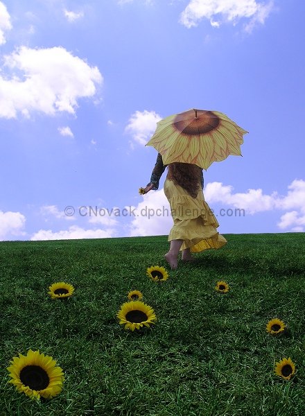
The image is a good concept for this challenge whether original or not the idea works well and I like the composition.
The biggest problem in my view is the sky as mentioned in the forum well not really the sky but the clouds they appear to be slightly blown out which diverts attention from the subject.
I would have liked to seen some bright yellow similar to the flowers either on the clothing or umbrella to give it a lift in contrast because as it stands now the main subject is a little flat in color.
I also see a little color shift in the grass area not sure how this was done but overall the image is a good idea well composed and scored reasonably well in a low scoring challenge and only needed slight adjustments to make it score much higher.
|
|
 Photographer found comment helpful. Photographer found comment helpful. |
|
|
04/10/2006 08:27:30 AM |
I think this is a great shot other than the ground and girls being somewhat dark. I would try lassoing both and doing a levels adjustment and maybe play with the selective color a bit, make the yellow really pop out. hope this helps...top 100 isnt a bad place to finishe considering the competition for this challenge :o)
~~Cher~~ |
|
| Photographer found comment helpful. |
|
|
04/10/2006 08:23:45 AM |
| Very cool and creative concept! I feel there's a slight blueish tinge to the grass and her legs....be well worth playing round in selective colour/curves as this is such a lovely original idea. Good work! |
|
| Photographer found comment helpful. |
Comments Made During the Challenge  |
|
|
04/09/2006 06:11:24 AM |
| could use a bit more saturation, but I like it anyway ;) |
|
| Photographer found comment helpful. |
|
|
04/05/2006 04:33:07 PM |
| It looks like a sunflower just got up and walked away--very charming and creative. I would say the skin tones look a little blue, though. Or is that just my monitor? |
|
| Photographer found comment helpful. |
|
|
04/05/2006 03:27:49 PM |
| Very fanciful! I love it. 10 |
|
| Photographer found comment helpful. |
|
|
04/03/2006 09:04:13 PM |
| Very nicely composed. Though it's missing some contrast. |
|
| Photographer found comment helpful. |
|
|
04/03/2006 07:03:33 AM |
| I would have liked the horizon to be level..... |
|
| Photographer found comment helpful. |
Home -
Challenges -
Community -
League -
Photos -
Cameras -
Lenses -
Learn -
Help -
Terms of Use -
Privacy -
Top ^
DPChallenge, and website content and design, Copyright © 2001-2026 Challenging Technologies, LLC.
All digital photo copyrights belong to the photographers and may not be used without permission.
Current Server Time: 02/01/2026 08:53:14 AM EST.