| Author | Thread |
Comments Made During the Challenge  |
|
|
08/12/2003 01:22:32 AM |
| I'm sorry, but I don't think this fits the challenge at all. I really like the picture on it's own, but applying the challenge criteria it just doesn't stand up. On the plus side, it's really sharp and the colors are nice. |
|
|
|
08/09/2003 05:40:45 PM |
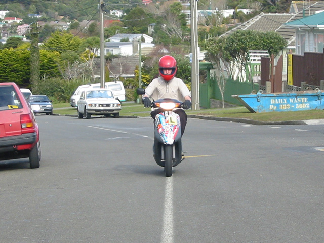
| Cropping better would have helped this one...great idea though. |
|
|
|
08/09/2003 07:58:44 AM |
| Needs cropping. Too many items in the picture. Play with the Aperture.Focusing the rider and blurring out the background with give the picture some depth. |
|
|
|
08/08/2003 12:20:55 PM |
| Good idea for the challenge. In my opinion, using the rule of thirds would have made this shot even better. |
|
|
|
08/07/2003 12:29:31 PM |
| a little washed out. could use more contrast and saturation to strengthen image. |
|
|
|
08/06/2003 01:03:40 PM |
| There is too much business in the background -- it keeps drawing my eye. A shallower depth of field plus a little tighter crop (eliminating the half car on the left) would have made this a much better shot. Unique idea on the right angle part is a plus. |
|
|
|
08/06/2003 04:13:47 AM |
| For some reason this looks very familiar! I personally would have prefered a shallower DOF tho, still an interesting idea. Where is this exactly? - 6. |
|
|
|
08/06/2003 01:27:55 AM |
|
Home -
Challenges -
Community -
League -
Photos -
Cameras -
Lenses -
Learn -
Help -
Terms of Use -
Privacy -
Top ^
DPChallenge, and website content and design, Copyright © 2001-2026 Challenging Technologies, LLC.
All digital photo copyrights belong to the photographers and may not be used without permission.
Current Server Time: 02/01/2026 10:34:58 AM EST.