| Author | Thread |
|
|
04/11/2006 04:14:34 PM |
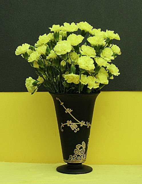
I really like the composition and layout here. The only thing I think you could have done better, post process, would be to apply neat image or something like it to the top background. The two color split, with contrasting top and bottom of the flowers and vase is excellent, but I'm distracted by the texture on top.
You also have a little wrinkle on the yellow bottom near the left side of the vase, and the color on bottom could have been brightened a little with more direct lighting.
I know, I know. You've seen my yellow entry, and who am I to say these things?! But I really do like your shot and only want to offer what I see and have tried to learn myself. |
|
 Photographer found comment helpful. Photographer found comment helpful. |
|
|
04/11/2006 11:08:25 AM |
That vase has been mentioned a couple of times, it is a Tiffin Glass Satin Finished black glass vase with Rockwell Sterling overlay. One of our favorite black glass pieces, we have over 100. Chose the satin finish as has almost no reflective problems, as most other glass does. Easy to use even a flash and get no bad spots with it!! Small tip that does work! LOL
Jacque |
|
|
|
04/11/2006 10:50:34 AM |
Most of what eschelar said below were also my thoughts on the technical aspects.
My only additional technical observation is that it would have been good to bring out the colours and contrast (especially the contrast) in post-processing. The lighting looks a bit flat, so post-processing would have made the contrast and tones more interesting.
While this is a nice 'classic' composition, it just lacks that extra something to hold my interest for very long. The most interesting part of the shot for me was the pattern on the vase. |
|
| Photographer found comment helpful. |
|
|
04/11/2006 04:14:47 AM |
I like the idea, but there are some serious fatal flaws that I see in this pic.
#1 Focus. I would personally have used a deeper DOF to get more flowers in focus as well as keeping all parts of that vase sharp. Nice decorative work on it.
#2 Depth of Frame. I think you could have greatly benefited by moving your whole setup about a half foot to a full foot farther away from the wall. This would have greatly helped in making the top part of the background Black as Black and would also put it in the defocused area. This might have helped if there was a problem with the actual graininess on the backdrop material.
#3 Backdrops. Ooof. To be honest, I prefer the softer yellow of the cloth at the bottom of the frame over the yellow paper. Would there have been a way to set up the yellow cloth in such a way that it 'bent' upwards as it went back to allow a totally fluid and seamless backdrop? You could then have used the black paper to create a nice flat line across the top. This would have been challenging as you would have needed to light the background. One idea would be to have a light stuck through the cloth and hidden behind the carnations. It would have had a nice, balanced effect. It still would have needed a bit of side lighting to give depth and definition to the carnations, but that would have been OK because the subject would have been moved away from the backdrop.. right?
#4 Blacks. I felt that the main idea of this picture was to allow the top of the black vase to meld seamlessly into the background when I first saw the thumbnail. Doesn't look like it worked out so well here.
If you got the lighting right and moved the flowers/vase forwards, you would likely have found that your actual Background was quite black already (keep that backlighting LOW). This would have made it easier to hit curves and meld away.
I really like the idea of a vase that looks like a drip from the blackness coming to form a glass object with flowers sticking out of it.
It was a great idea. |
|
| Photographer found comment helpful. |
|
|
04/10/2006 09:24:10 PM |
| The idea here Jacque is a good one. However, there isn't enough punch in the image. The WB seems a tad off and a tighter crop would have served this image a lot better. |
|
| Photographer found comment helpful. |
|
|
04/10/2006 09:48:50 AM |
I like the idea here...Would maybe chop off the dangling flower to the left of the bunch, but otherwise well composed...I'm not one for centered images, but with the background this works...
It seems the flowers are a little out of focus, but the vase is sharp...and could maybe use a little color balance to bring up the yellow in the flowers...
|
|
| Photographer found comment helpful. |
|
|
04/09/2006 11:36:14 PM |
Strong composition and well within the challenge definition. The colours are a bit flat - the yellow in the carnations seems too weak - and there is some noise in there as well. Personally I would have tightened the top vertical crop to give more of a 1/3 black, 2/3 yellow in the background but then again - caveat emptor!
I also think it would have been slightly stronger if the yellow saturations had been reversed - more intense on the carnations and less on the lower background.
Liked the image a lot. |
|
| Photographer found comment helpful. |
|
|
04/09/2006 09:10:58 PM |
The colors are perhaps a wee bit flat and I wish I could see more detail in the carnations. It's also a little noisy, especially in the green. Perhaps that's a camera thing for you, as I notice that you ran noise reduction. I didn't come upon this in the voting, but if I had I'd probably have given it a 5 -- in focus, meets challenge, average image, with slightly flat lighting.
I do really like the composition, though. |
|
| Photographer found comment helpful. |
|
|
04/09/2006 08:18:39 PM |
I didn't vote on all photos in this challenge, but I got this one. Count yourself lucky I gave you 8 - I may have downgraded later if I'd looked at it more carefully ;-)
Note to self: Don't do speed voting. |
|
| Photographer found comment helpful. |
|
|
04/09/2006 08:13:53 PM |
| For some reason, the yellows have a really green tint. It appears the white balance (probably shot on auto) was a bit confused. It also appears a bit "flat", as mentioned - sidelighting would add a lot of pop. |
|
| Photographer found comment helpful. |
Comments Made During the Challenge  |
|
|
04/05/2006 10:44:32 AM |
| This is a very good concept! Needs more dramatic lighting to really make it "pop". |
|
| Photographer found comment helpful. |
|
|
04/03/2006 03:59:54 PM |
| I like the idea of the kind of ying and yang thing. But, I don't think the two yellows work together. |
|
| Photographer found comment helpful. |
Home -
Challenges -
Community -
League -
Photos -
Cameras -
Lenses -
Learn -
Help -
Terms of Use -
Privacy -
Top ^
DPChallenge, and website content and design, Copyright © 2001-2025 Challenging Technologies, LLC.
All digital photo copyrights belong to the photographers and may not be used without permission.
Current Server Time: 04/07/2025 12:31:57 AM EDT.