DPChallenge: A Digital Photography Contest You are not logged in. (log in or register
 
Challenge Entries
Portfolio Images
This image is not part of a public portfolio.
JAX
JAX
Kitty212


Photograph Information Photographer's Comments
Challenge: Children's Toy (Basic Editing III)
Camera: Canon PowerShot G5
Location: home with window light
Date: Mar 29, 2006
Aperture: 5.6
ISO: 100
Shutter: 800
Galleries: Macro
Date Uploaded: Mar 29, 2006

N/A

Statistics
Place: 258 out of 300
Avg (all users): 4.3069
Avg (commenters): 2.6667
Avg (participants): 3.9767
Avg (non-participants): 4.5517
Views since voting: 625
Views during voting: 244
Votes: 202
Comments: 6
Favorites: 0


Please log in or register to add your comments!

AuthorThread
04/17/2006 05:30:41 PM
Greetings from the Critique Club!

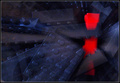
Your entry has the fundamental qualities of a great "stock photo" shot, with wonderful bright colours, a macro element that fills the entire frame with the subject, and an impact that gives immediate satisfaction with what you are in all probability trying to accomplish here. In that respect, it's a good composition.

There are a few things you should have done differently though, in my opinion, which may have resulted in an even greater impact. Although depth of field is satisfactory, focus is not good. For such a close-up shot, high impact is only achieved with razor-sharp focus. As well, lighting is generally poor, because it seems that post-processing (or perhaps even the original photo) reveals lots of grain, an indication that the camera did not have enough light enough to properly expose all parts of the image.

I feel you could have spread out the jacks differently, so that more variety appeared across all parts of the image. The lower right is very red, which draws the eye, and detracts in my opinion.

Lastly, the heavy blue border is a bit too heavy. A lighter blue, and perhaps a thinner border, would have been a less distracting choice I think.

Keep at it though, your eye and sensibilities for composition are good!

Hope this helps,
Louis
  Photographer found comment helpful.
 Comments Made During the Challenge
04/10/2006 05:25:51 AM
I like the concept but I feel the colors are over saturated and so you loose some of the detail in the image.
  Photographer found comment helpful.
04/06/2006 11:40:31 PM
ok
  Photographer found comment helpful.
04/06/2006 04:29:24 PM
Interesting idea but the reds are clipped. There is no detail in the red part of the picture.
  Photographer found comment helpful.
04/06/2006 06:13:50 AM
A neat idea, but there are a few things that could have been executed better. The lighting is a bit harsh -- try bouncing the flash off of something to avoid those hot spots. The file size is only 33K-ish, which is why it looks so pixelated. Learn to compress it so that it's as close to the 150k as possible to avoid that. And I'd probably ditch the blue border, in all honesty. Not trying to sound like a jerk or anything with all of this, just some honest opinions on how you might improve upon a good idea :)
  Photographer found comment helpful.
04/05/2006 08:38:29 AM
I like the bright colors.
  Photographer found comment helpful.


Home - Challenges - Community - League - Photos - Cameras - Lenses - Learn - Help - Terms of Use - Privacy - Top ^
DPChallenge, and website content and design, Copyright © 2001-2025 Challenging Technologies, LLC.
All digital photo copyrights belong to the photographers and may not be used without permission.
Current Server Time: 04/07/2025 02:48:00 PM EDT.