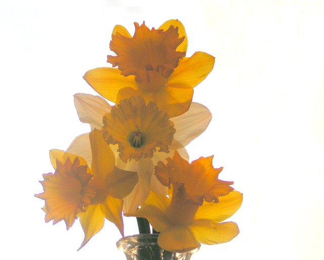
Agree with Lev on this one.. I would try a portrait composition .. a 4x6 would be great.. leave out the white space.. tighter crop and more of the vase..
The colours is a little washed out.. try the curves and work it up a little..
Would have been a great stock shot.. did you try? hee hee.. :)
Kelli, since you asked for a critique, here it goes. I see several issues with this shot:
it appears a bit washed out - in a "high key" photo there have to be some (few) really dark, even black accents, otherwise it becomes... yes, washed out :). I understand that you went for a soft focus feel, but I would prefer to see more texture on the petals... One does not have to exclude the other. Also, I think centered composition hurts it a bit. And finally, there are noticable purple fringes around the flowers. This is perhaps not your fault but your camera's, but it does weigh on the shot's visual appeal.
this is a beautiful shot..... well photographed - the flowers have an overall orange cast.. with advanced editing available, adding more yellow to the flowers might have been a good idea
Yes they are, almost too soft, most come across with a more orange tinge than a yellow on my screen, which I did just adjust and calibrate. The soft focus is very well done and I'm usually not a big fan of soft focus but this one is so well done you get more a feeling of a billowy (is that a word) breeze than a fuzzy effect like most give you. Very nice overall but one other thing bugs me and that's the coloration in the top of the vase, not sure why but it keeps jumping out at me. I see now from the one flare on the left side of the vase it's from the sun light, and that is causing the hazy feel, that's the word, hazy, not billowy. But the haze works well here, an 8