| Author | Thread |
|
|
08/06/2003 07:32:12 AM |
| I think your photo should have scored higher. I gave you an 8. |
|
Comments Made During the Challenge  |
|
|
08/05/2003 03:12:04 PM |
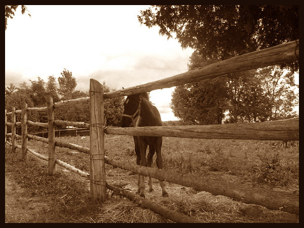
| As the animal appears to have been uncooperative, I would have tried to shoot around it if possible. Just seems in the way here because of its centering.. Nice comp, use of sepia otherwise. |
|
|
|
08/05/2003 07:53:29 AM |
| I'm a sucker for horses. Especially tiddly babby ones! I like the washed out sky, gives it a heavenly feel. 7. |
|
|
|
08/02/2003 02:39:11 AM |
| I think you should play with the levels some, because this whole photo seems a bit washed out... not enough dark areas. |
|
|
|
08/01/2003 05:44:22 PM |
|
|
|
08/01/2003 12:26:22 PM |
| Not sure this one fits garden, but its a nice shot though. |
|
|
|
07/31/2003 10:53:00 PM |
| I'd like to see the colt on this side of the fence. |
|
|
|
07/31/2003 08:52:27 PM |
| i wish the horse was more visable - nice pic though |
|
|
|
07/31/2003 07:50:02 AM |
| can't see challenge here without the title.. |
|
|
|
07/31/2003 03:01:08 AM |
| The sepia tone really works for this picture, hope you are not penalised by the Topic Police as not strictly adhereing and blah!! |
|
|
|
07/30/2003 09:23:22 PM |
| i like the soft tones, but doesn't fit the theme for me. this would be more like 'country life'. |
|
|
|
07/30/2003 10:15:01 AM |
| great colors--not to sure were the garden is- but still a good photo-- |
|
Home -
Challenges -
Community -
League -
Photos -
Cameras -
Lenses -
Learn -
Help -
Terms of Use -
Privacy -
Top ^
DPChallenge, and website content and design, Copyright © 2001-2025 Challenging Technologies, LLC.
All digital photo copyrights belong to the photographers and may not be used without permission.
Current Server Time: 04/07/2025 12:58:40 PM EDT.