| Author | Thread |
|
|
04/20/2006 05:26:54 PM |
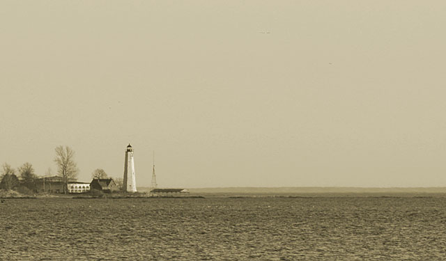
| I love minimalist images and I think this has a lot going for it, but probably went too far. There is so much sky that the lighthouse gets lost with the low contrast duotone editing choice. I think that if that contrast was higher and/or you cropped more off the top & right, it would improve the shot by allowing the viewer to really see more of the subject (provided that the subject is in fact the lighthouse). |
|
 Photographer found comment helpful. Photographer found comment helpful. |
|
|
03/31/2006 04:56:55 PM |
Greetings from the Critique Club!
What a lovely image, such a peaceful feeling, I love sea shots and lighthouses so this is a nice shot overall for me to start with.
But evidently not the general public from the looks of the score and placing.
If I were to compare this to the original by dan_pendleton there are several differences to start but let's just talk about this one by itself.
The overall composition is alright but all the negative space doesn't really work for me on this shot. Maybe zooming in closer to the lighthouse to make it a bigger part of the shot so it really grabs my attention or at least holds it. The duotone is nice but very light, not a lot of darker to lighter, it's rather dull and not a lot of variation to the tones.
The noise also does not lend to this shot to me, a crisper shot would probably do better and I really would love to see this shot with the color.
I also would like to thank you again for the advice you gave me on my flyer. I have it printed out and am still working on all of it.
Hope my comments help, again, love the idea, the sea and the lighthouse.
Good luck in future challenges!
Deannda |
|
| Photographer found comment helpful. |
Comments Made During the Challenge  |
|
|
03/26/2006 08:59:50 AM |
|
| Photographer found comment helpful. |
|
|
03/25/2006 07:00:37 PM |
|
| Photographer found comment helpful. |
|
|
03/25/2006 04:46:43 PM |
| Nice, I see a few spots in the sky you could have cloned out. |
|
| Photographer found comment helpful. |
|
|
03/24/2006 02:00:20 PM |
| I'm not sure I'm a big fan of the duotone here, but the fact that it's a lighthouse does get you a bonus point from me. |
|
| Photographer found comment helpful. |
|
|
03/24/2006 01:27:13 PM |
| Too bad it wasnt zoomed in a little closer on the lighthouse. Good job though! |
|
| Photographer found comment helpful. |
|
|
03/24/2006 08:17:56 AM |
returning for comments:
An image that will outlive the challenge. Bumping up. |
|
| Photographer found comment helpful. |
Home -
Challenges -
Community -
League -
Photos -
Cameras -
Lenses -
Learn -
Help -
Terms of Use -
Privacy -
Top ^
DPChallenge, and website content and design, Copyright © 2001-2025 Challenging Technologies, LLC.
All digital photo copyrights belong to the photographers and may not be used without permission.
Current Server Time: 04/08/2025 01:51:16 AM EDT.