| Author | Thread |
|
|
08/12/2003 09:14:23 AM |
thanks everyone for the comments!
Message edited by author 2003-08-12 13:15:07. |
|
|
|
08/12/2003 08:08:10 AM |
Greetings from the Critique Club, Jason :)
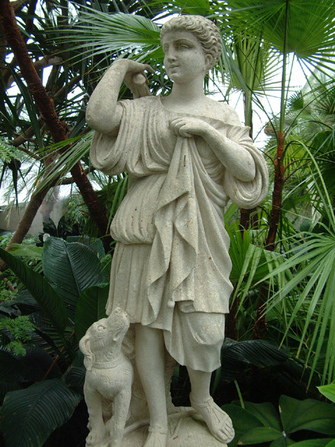
Composition: In my opinion there is much room for improvement. I have the following suggestions: The background is very "busy" meaning it distracts from your subject. Blurring the background by chosing a more shallow depth of field (see below) could have helped. Because of the wide depth of field the photo lacks visual depth meaning it's very 2D. One effect of this is for example that the palm leaf in the background looks as if it's "growing" out of the head of your statue. Then I think the statue was cropped too much at the bottom, the foot is missing. And as Konador already said, the statue seems to fall over to the right side. It should be rotated.
Lighting: The lighting is very flat. I know you probably couldn't change it at that moment, but this way it looks a bit boring. Some light from the side would create some shadows highlighting the structure of the statue and thus add more drama to the photo.
Focus: Everything is in focus. While sometimes this is a good thing sometimes it's better to direct the viewers concentration on your subject by blurring the backgound. Chosing a wider aperture to create a more shallow depth of field would be the solution. This also would have given your photo additional visual depth.
Challenge: The challenge was clearly met.
Creativity: Well, overall I would say this is more a snapshot than a photo you put much thought into. It certainly fits the challenge but at least to me it's not very interesting. People have different tastes though ;-)
I just saw that this was your first photo on DPC. I don't know how much experience in photography you have in general, but I suggest reading through the tutorials on this site and on the internet. Try recreating the techinques described there. This helped me a lot when I started with photography and I'm still learning ;-)
Good look in future challenges!
Stephan
|
|
Comments Made During the Challenge  |
|
|
08/05/2003 05:03:13 PM |
| Stright on picture of a statue |
|
|
|
08/02/2003 06:08:23 PM |
| Beautiful statue. It would be more effective if it was less centered though. |
|
|
|
08/02/2003 06:33:43 AM |
| i think it needs to be rotated anticlockwise slightly. it looks like its going to fall over |
|
|
|
07/30/2003 07:37:53 AM |
| The back ground is a bit cluttered, and doesn't help the subject much. |
|
Home -
Challenges -
Community -
League -
Photos -
Cameras -
Lenses -
Learn -
Help -
Terms of Use -
Privacy -
Top ^
DPChallenge, and website content and design, Copyright © 2001-2025 Challenging Technologies, LLC.
All digital photo copyrights belong to the photographers and may not be used without permission.
Current Server Time: 04/08/2025 01:32:39 AM EDT.