| Author | Thread |
|
|
10/12/2007 11:27:35 AM |
wow, very effective. nice work
|
|
|
|
03/29/2006 01:58:54 PM |
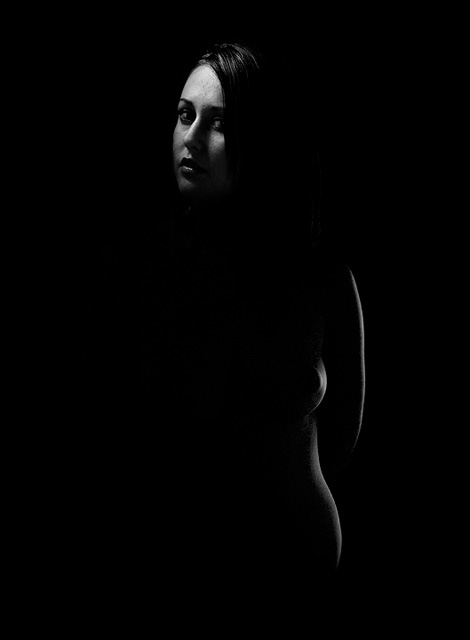
| Congratulations on your top 20 finish with this lovely shape suggestion. |
|
Comments Made During the Challenge  |
|
|
03/28/2006 05:01:31 PM |
| I like the curves (a lot) but would have lit the face a bit less, shadows are too strong there and conflict with the suggestive shadows of the body. Just my 2 cents.. :) |
|
|
|
03/25/2006 05:19:42 AM |
| very good low key photo, not sure whether a reflecter on the left would have a touch more to the image. |
|
|
|
03/24/2006 08:08:36 PM |
| Good photo...maybe just a little less light on the models face would add something to the over all photo. |
|
|
|
03/24/2006 04:13:16 PM |
| Certainly low-key, but a bit too dark in my opinion. |
|
|
|
03/24/2006 03:05:42 AM |
| Very interesting exposure. I had to look at this photo several times to pick up all the detail. Well done. I gave it an 8. |
|
|
|
03/23/2006 07:44:45 PM |
|
|
|
03/23/2006 03:47:42 PM |
| This may be the best nude in the challenge. The lighting is selective and thoughtful. |
|
|
|
03/23/2006 04:31:33 AM |
| beautiful suggestive lighting...well done, suits this challenge well |
|
|
|
03/23/2006 12:40:51 AM |
| I would like to have seen a little more of the features lit up, to make it seem all one body. |
|
|
|
03/22/2006 09:11:41 PM |
| Super! The image that probably should be used as an ideal example of "low key". Well done! ...and sexy, too. |
|
|
|
03/22/2006 06:47:20 PM |
| I wish a little more of her body was outlined. Good idea though. 5 |
|
|
|
03/22/2006 04:20:21 PM |
| As you scroll down that hint of curve shows up. Nice job. |
|
|
|
03/22/2006 01:17:55 PM |
| I wish there were more detail in the shadows. Her head seems disconnected from her body here. If there is any detail in the lines of her neck, I can't see it on my monitor, and I have been doing well viewing so far in this challenge. I like the lighting on her face and, considered seperately, the lighting along her side. Her forehead is the biggest/brightest thing in the composition, and it draw attention up and out of the frame (although I realize in basic editing burning that down is not an option). I love the lines of her arm, hip, breast. The two subjects - her face and her curves - seem to compete with each other here. As if they really belong in two seperate images. |
|
|
|
03/22/2006 01:12:17 PM |
|
|
|
03/22/2006 11:24:19 AM |
Interesting effect. The way you have lit the head from one source and the body from the other source gives a bit of lop-sided, nearly disembodied look.
Cool. |
|
Home -
Challenges -
Community -
League -
Photos -
Cameras -
Lenses -
Learn -
Help -
Terms of Use -
Privacy -
Top ^
DPChallenge, and website content and design, Copyright © 2001-2026 Challenging Technologies, LLC.
All digital photo copyrights belong to the photographers and may not be used without permission.
Current Server Time: 02/01/2026 09:12:46 AM EST.