| Author | Thread |
|
|
09/04/2006 07:55:40 PM |
| Looking at the cheese photo again are we? ;-) |
|
 Photographer found comment helpful. Photographer found comment helpful. |
|
|
08/17/2006 11:49:01 AM |
| Here I go breaking my own request. I like this shot. Like most everyone has said (including yourself) the harshness of the lighting hurt you. The pose is great. The idea is really good. You have alot of potential. Way to go. |
|
| Photographer found comment helpful. |
|
|
06/13/2006 06:27:01 AM |
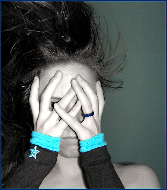
| I didn't vote in this challenge, but probably would have scored this a 5-6. Love the pose and composition. Great job achieving selective desat in basic editing too (I still have trouble with that - LOL). The lighting (as you already know) is what really hurt you here. Still, I think it's a good shot and the fact that you "spotted" things that you wanted to fix indicates your learning curve is definitely on the right track. Keep up the good work! |
|
| Photographer found comment helpful. |
|
|
06/07/2006 06:31:46 AM |
| This image definitely has potential for being a great "high fashion" shot. The hair is interesting and the pose intriguing, but I must agree with the general opinion on the lighting. The on-board flash is simply too harsh for this particular image and it might help to simply use ambient or natural lighting from the side to provide more even or dramatic lighting without the harshness of the onboard flash. I do and don't like the selective desaturation. I think it's effective, but the cyan tones don't do much for me visually. You did a great job matching the color in your border though and if I were a bigger fan of that particular color, I think it might be more appealing to me on a personal level. |
|
| Photographer found comment helpful. |
|
|
04/03/2006 09:47:06 AM |
In response to your your request for comments: I rated this picture a 5. Although in general it's a well-composed photo and has interesting elements in the hands, ring, warmers and hair, a couple of things prevented me from voting higher. Most significant for me was probably the overall subject matter, which is not too interesting (my own entry in this challenge scored about the same and was also prosaic). But, there's a mood offered in this image in the reaction of the model which is interesting. The picture isn't the best shot, since apparent flash has peaked the highlights a bit, and you can see the harsh shadows the flash has created, which is never really good. Colour is a bit off, and may have benefitted from some more post. You may have intentionally desaturated, in which case even more emphasis on the bright cuffs may have been interesting. The grain is pretty noticeable, which again could have been corrected in post. It could be argued that the grain gives it a grittier feel that matches the subject, but for me it just seems to be a lot of unintended grain.
I think perhaps thinking about this more may have helped greatly. It kind of looks like a snapshot, but positioning your view so that there is more of a dramatic angle on the face, with perhaps a lot of emphasis and detail on the eye, may really have helped. If you desaturated purposefully, perhaps also going duotone would have helped, with more dramatic contrasts.
I hope this helps... thanks for asking for the comment! |
|
| Photographer found comment helpful. |
|
|
03/31/2006 12:09:43 PM |
You know, the harsh shadows may have been what kept this picture under a 5 in voting - but it REALLY had a lot of potential. You have a pretty model, interesting hand wraps, good expression, good composition and the hair is interesting. Really, the only problems were in the lighting...
There is still a lot you can do with this photo now that the contest is over and you can play with "non-basic-rules" type of editing - the hard lighting works well for a lot of high and low key effects. :) |
|
| Photographer found comment helpful. |
Comments Made During the Challenge  |
|
|
03/28/2006 01:58:09 PM |
| Lighting is a little flat, perhaps from the onboard flash. Interesting use of color but it tends to distract one from the main subject of the hands. |
|
| Photographer found comment helpful. |
|
|
03/28/2006 12:13:02 PM |
very nice idea
unfortunately the hands are toasted and the skin tones uneven
(perhaps a lower setting on the flash would have helped) |
|
| Photographer found comment helpful. |
|
|
03/24/2006 09:18:08 AM |
|
| Photographer found comment helpful. |
|
|
03/24/2006 07:06:41 AM |
| Nice composition, colors/desaturation choices, and nice tonal range. Somewhat disturbing image made me look again. More sharpness on hands would be better, and more eye/s are almost always better. |
|
| Photographer found comment helpful. |
|
|
03/22/2006 04:22:48 PM |
| i think the selective coloring is against the rules and IMO does not add to the shot |
|
| Photographer found comment helpful. |
|
|
03/21/2006 10:45:38 PM |
| some burnt areas, very noisy |
|
| Photographer found comment helpful. |
Home -
Challenges -
Community -
League -
Photos -
Cameras -
Lenses -
Learn -
Help -
Terms of Use -
Privacy -
Top ^
DPChallenge, and website content and design, Copyright © 2001-2025 Challenging Technologies, LLC.
All digital photo copyrights belong to the photographers and may not be used without permission.
Current Server Time: 04/07/2025 01:37:56 PM EDT.