| Author | Thread |
Comments Made During the Challenge  |
|
|
03/21/2006 01:42:42 PM |
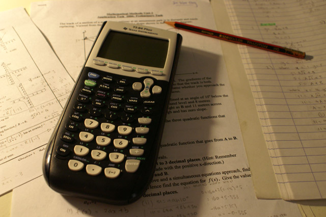
| The shadow interrupts this picture and it is a bit to strong in the yellow color. But a good idea. |
|
|
|
03/20/2006 10:48:48 AM |
| The harsh shadow from the calculator really hurts this image. You could soften the shadow and increase the lighting by using a reflector (foam core, white cardboard, whatever) camera right. The color balance is also slightly off and the DOF is too shallow such that the calculator is out of focus. |
|
 Photographer found comment helpful. Photographer found comment helpful. |
|
|
03/19/2006 12:37:31 PM |
| The focus is not true in this shot - and the shadow is really distracting. Try a tripod with a longer shutter speed. Nice angle usage - just little things that mean a lot. |
|
| Photographer found comment helpful. |
|
|
03/18/2006 01:36:18 PM |
| Nice set up, lighting needs work, image is dull |
|
| Photographer found comment helpful. |
|
|
03/17/2006 05:47:11 AM |
| nice composition the angle is great not to dead on but not to tilted either |
|
| Photographer found comment helpful. |
|
|
03/16/2006 12:33:23 PM |
| good comp and pov, lighting is the biggest problem to me |
|
| Photographer found comment helpful. |
|
|
03/16/2006 10:09:19 AM |
| The lighting needs to be improved. Also the focus point is where?? |
|
| Photographer found comment helpful. |
|
|
03/15/2006 07:25:56 AM |
| Overall composition is technically OK but point of focus seems too low to me and I'd have liked to see the calculator on. |
|
| Photographer found comment helpful. |
|
|
03/15/2006 07:04:27 AM |
|
| Photographer found comment helpful. |
|
|
03/15/2006 05:13:04 AM |
The arrangement and composition of this image is fine.
Lighting and color could be improved. The shadow of the calculator distracts from the image. Adding lighting from the right would mute the distaction, illuminate right side detail and add interest to the image.
White balance is off which gives it a yellow hue that should be corrected in post processing.
You might also consider shifting your central focus point from the center of the calculator to the "5" on the keypad. That would excentuate the effect of your shallow depth of field and minimize the distracting effect of having the near foreground slightly out of focus. |
|
| Photographer found comment helpful. |
|
|
03/14/2006 07:19:16 PM |
| this could be my homework... |
|
Home -
Challenges -
Community -
League -
Photos -
Cameras -
Lenses -
Learn -
Help -
Terms of Use -
Privacy -
Top ^
DPChallenge, and website content and design, Copyright © 2001-2025 Challenging Technologies, LLC.
All digital photo copyrights belong to the photographers and may not be used without permission.
Current Server Time: 04/07/2025 01:31:23 AM EDT.