| Author | Thread |
Comments Made During the Challenge  |
|
|
08/03/2003 05:36:15 AM |
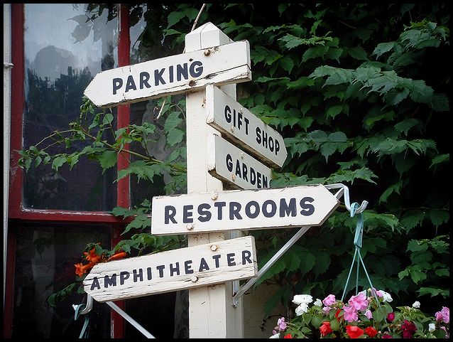
| Made me laugh - 'amphitheatre' seems so out of place on that sign; composition is a touch dull though: was there nothing to add any visual interest at either side? It's a very weak position in the frame, dead centre ... |
|
|
|
08/02/2003 07:19:19 AM |
|
|
|
08/01/2003 02:40:22 PM |
| neat sign..... where is this at? |
|
|
|
08/01/2003 02:11:22 PM |
| nice and simple, i like it, nice compostion |
|
|
|
08/01/2003 07:29:34 AM |
| Are those flower I see?? Why yes it is.... 7 for the shot minus 2 for seeing flowers = 5 |
|
|
|
08/01/2003 04:10:19 AM |
| Clear, colorful, maybe better if a bit more of the flowers were showing? |
|
|
|
07/31/2003 11:53:13 AM |
| nice enough image but couldn't tie this to The Garden |
|
|
|
07/31/2003 11:06:03 AM |
| Good find :-) Maybe you shouldn't have cropped out the flowers completely in the lower right hand corner. The only thing I really find out of place in this pic. The rest is good. |
|
|
|
07/30/2003 11:11:11 PM |
| Great position of colors nice shadows and highlights |
|
Home -
Challenges -
Community -
League -
Photos -
Cameras -
Lenses -
Learn -
Help -
Terms of Use -
Privacy -
Top ^
DPChallenge, and website content and design, Copyright © 2001-2026 Challenging Technologies, LLC.
All digital photo copyrights belong to the photographers and may not be used without permission.
Current Server Time: 02/01/2026 12:22:21 PM EST.