| Author | Thread |
|
|
08/10/2003 07:27:46 PM |
*Critique Club*
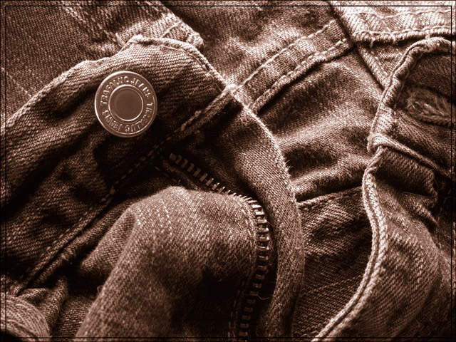
Your detail here is amazing. Excellent focus and clarity! It really draws me in and makes me want to look the entire photo over for the patterns in the fabric. I think this is perfect for the challenge.
I don't think it would have had this impact on me had there been a contrasting fabric or person in the jeans. I think that this would have taken away from the detail.
I like the sepia tones of the photo. I think that it gives us a better chance to view the details and the color isn't getting in the way.
Lighting is also very nice. I think that the lighting is what helps to bring out the detail here. Had there been bright spots or shadows, this would not have turned out this nice. You did an excellent job with this also.
The angle and framing/cropping are perfect for this challenge, and also perfect for the bringing out the detail. I love the closeness, and I think that this is what totally makes the photo. It enhances everything else you did right.
The only downfall is the border. I really dislike this kind of border. It seems to be more of an intrusion on the photo. It is no longer an addition to the outside OF the photo, but it is now PART of the photo, and in my opinion is rather distracting. I don't like it at all, but your photo is wonderful.
~Heather~ |
|
Comments Made During the Challenge  |
|
|
08/03/2003 02:43:07 PM |
I have to say that "unzipping" is one of my favorite activities.
This superb image only supports that. Sepia is great for this image. Excellant technical quality. |
|
|
|
08/01/2003 09:44:19 AM |
| I think ths would have worked better in colour. Also perhaps a contrasting material in the jeans (or a person :-) might have made for more impact. Good effort though. |
|
|
|
07/31/2003 10:02:03 PM |
| i really like the picture and the choice of duotone. the texture in the jeans is great. the one thing that would greatly improve your overall presentation is having a boarder that is even on all sides. the right side is smaller than the left. the picture is very nice, however, the presentation could be improved. |
|
|
|
07/31/2003 04:00:20 PM |
| Excellent toning. Border is a negative. 8 |
|
|
|
07/31/2003 03:57:25 PM |
| good detail, and i like the sepia choice, 9 |
|
|
|
07/31/2003 03:51:22 PM |
| Well if there were some skin behind the zipper, perhaps, good focus |
|
|
|
07/31/2003 05:49:01 AM |
| great color...very effective |
|
|
|
07/29/2003 01:58:12 AM |
| Nice sepia tone. This looks like something I'd see in an ad for jeans. The lighting is spot on and the challenge, of course, met head on. Only thing is that the frame is smaller on the right side. |
|
|
|
07/28/2003 06:35:00 AM |
|
Home -
Challenges -
Community -
League -
Photos -
Cameras -
Lenses -
Learn -
Help -
Terms of Use -
Privacy -
Top ^
DPChallenge, and website content and design, Copyright © 2001-2025 Challenging Technologies, LLC.
All digital photo copyrights belong to the photographers and may not be used without permission.
Current Server Time: 04/07/2025 01:07:13 PM EDT.