| Author | Thread |
|
|
03/14/2006 01:45:38 AM |
Greetings from the Critique Club!
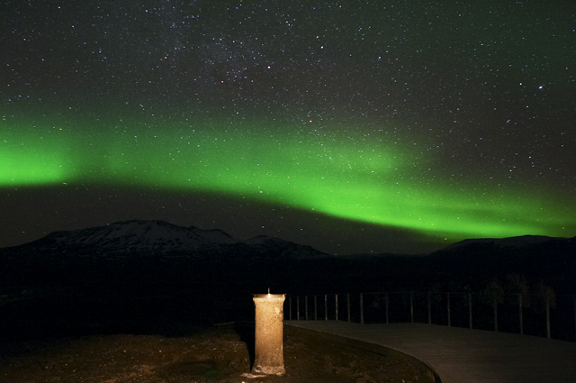
Aesthetic: Aurorea has been such a cliche on this site that you really need to make it different from other similar shots to score high.
Technical: The sundial (which is foreground here) seems to be burnt out due to long exposure. Background Aurorea is well captured.
Challenge: Well yes- this certainly is painting with light. So it does fit the challenge.
Conclusion: Overall an average composition. As one of the comments says - the beautiful background is not complimented by equally beautiful forground. Considering this is just second submission from you, you have faired well. Looking forward to more submissions from you.
I'm by no means expert in area of photography. My comments are purely based on my limited understanding of technology and art behind digital photography. Apart from doing detailed evaluation of your submission, my intent is to learn different styles of photography by critically evaluating selective submissions. If you've got any questions about this critique, please feel free to contact me via email or PM.
Wish you a great day!
-Tej
|
|
 Photographer found comment helpful. Photographer found comment helpful. |
Comments Made During the Challenge  |
|
|
03/07/2006 08:19:37 PM |
|
| Photographer found comment helpful. |
|
|
03/07/2006 11:50:47 AM |
| this is very similar to another image |
|
| Photographer found comment helpful. |
|
|
03/07/2006 05:40:55 AM |
| I'm jealous of your surroundings, but I wish you'd done something a little different with the composition -- having the sundial so close to the center just doesn't work well for me. |
|
| Photographer found comment helpful. |
|
|
03/06/2006 11:53:27 PM |
| Amazing timing, the lighting is wonderful. |
|
| Photographer found comment helpful. |
|
|
03/04/2006 03:40:57 PM |
| Incredible motive! Simply stunning... 10 |
|
| Photographer found comment helpful. |
|
|
03/04/2006 02:22:16 PM |
| the sundial does add depth to the photo. |
|
| Photographer found comment helpful. |
|
|
03/03/2006 08:01:14 PM |
| Great sky and mountains. I don't care for the sundial though. If you cropped the bottom out, it would be great :) |
|
| Photographer found comment helpful. |
|
|
03/03/2006 12:36:51 PM |
| The sky and mountain look great, but the foreground is kind of ugly (7). |
|
| Photographer found comment helpful. |
|
|
03/01/2006 09:26:17 PM |
|
| Photographer found comment helpful. |
|
|
03/01/2006 11:58:31 AM |
| another one of these..i like your sky better, but maybe it shouldve been shot at another angle. |
|
| Photographer found comment helpful. |
|
|
03/01/2006 07:58:37 AM |
| i love the image, but might like it better without the lighted foreground. |
|
| Photographer found comment helpful. |
|
|
03/01/2006 03:46:29 AM |
|
| Photographer found comment helpful. |
|
|
03/01/2006 12:25:11 AM |
| The sky looks great but the sundial almost detracts from it. Perhaps a different composition, without the sundial in the centre might have looked better? |
|
| Photographer found comment helpful. |
Home -
Challenges -
Community -
League -
Photos -
Cameras -
Lenses -
Learn -
Help -
Terms of Use -
Privacy -
Top ^
DPChallenge, and website content and design, Copyright © 2001-2026 Challenging Technologies, LLC.
All digital photo copyrights belong to the photographers and may not be used without permission.
Current Server Time: 02/01/2026 05:48:09 AM EST.