| Author | Thread |
|
|
03/14/2006 01:39:31 PM |
|
|
|
03/13/2006 04:26:29 PM |
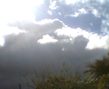
*Critique Club*
" He's up there" is a nice idea into the Comfort challenge. I have to give you credit, the first challenge is always the hardest to enter.
One of the first things I have learned about the challenges is no matter how good or bad your shot, if you don't utilize the entire space limit the voters will score you down.
You have a good idea and subject. That is defiantly a fundamental piece to a good entry. If you are going to use layers like the bushes in the front and clouds in background I would make sure one is very in focus. In this piece I would leave the bushes in focus. Also in the image it does look a little grainy, possibly noise from the lighting. Shots with sunlight are hard.
Overall its a great idea, I really hope despite some of the comments you continue to enter. The more you enter the better you get. |
|
Comments Made During the Challenge  |
|
|
03/07/2006 02:29:56 PM |
| you suck this doesnt eve deserve an more elaborated coment, so something basic for the small minded |
|
|
|
03/07/2006 02:02:32 AM |
| Brown ribbon contender I'm afraid. Concept could meet the challenge well, but this is a pretty poor sky picture all in all. Also a very small image - needs to be larger. |
|
|
|
03/04/2006 08:03:35 PM |
| There is no greater comfort for me than to look up in the sky and see what I call God clouds. :) |
|
|
|
03/04/2006 03:19:21 PM |
| The title really helps to explain this shot and it's connection to the challenge. I think if the picture were bigger with more rays of light and glowing color (without being overexposed) it might stand more on it's own. |
|
|
|
03/03/2006 08:11:45 PM |
|
|
|
03/03/2006 04:13:53 PM |
| For those who belive,nice work. |
|
|
|
03/02/2006 02:14:04 PM |
| A little too small. Try increasing the size of the image next time. |
|
|
|
03/02/2006 08:16:36 AM |
| He probably is,lovely sun rays shame they wernt all in focus would of been a top scorer |
|
|
|
03/02/2006 12:55:59 AM |
|
|
|
03/01/2006 04:49:47 PM |
| Very interesting capture of a figure, it appears! Overexposed a bit, though, which left you with the glare and some streaking. |
|
|
|
03/01/2006 09:04:13 AM |
| Photo is really too small to judge properly. It looks over exposed and grainy. |
|
|
|
03/01/2006 08:45:17 AM |
| Good idea for comfort, but picture is a little blown out. Bigger would have been better as well! |
|
|
|
03/01/2006 07:33:30 AM |
|
|
|
02/28/2006 10:18:19 PM |
| a bit small and grainy, too much like a phone camera pic for me... |
|
Home -
Challenges -
Community -
League -
Photos -
Cameras -
Lenses -
Learn -
Help -
Terms of Use -
Privacy -
Top ^
DPChallenge, and website content and design, Copyright © 2001-2025 Challenging Technologies, LLC.
All digital photo copyrights belong to the photographers and may not be used without permission.
Current Server Time: 04/07/2025 01:44:27 PM EDT.