| Author | Thread |
|
|
08/01/2004 10:45:35 PM |
I like this image alot!
I think one thing that could have helped it alot is upping the contrast, it seems a little washed out, and a high contrast in the this image would be a very cool effect.
Secondly, this photo BEGS for a border. I would suggest just a plain black one. It just amplifies the effect that your demonstrating here, and is nice for the viewer to have a clear edge around the photo.
Good work, awesome composition!
Lee |
|
 Photographer found comment helpful. Photographer found comment helpful. |
|
|
08/10/2003 04:31:17 AM |
Greetings from the Critique Club
By Inspzil
Sorry you get stuck with me for your first CC critique
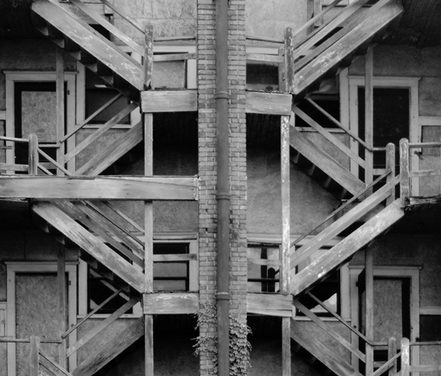
Composition - Good eye. This is a very good subject (I'm not really sold on it for this challenge in particular, but generally speaking I really like it). I like the asymmetry of it. GIves it some character. I like the symmetrical approach you've taken though. That really is cool. Good choice of tones for this photo as well
Technical - Just a bit unsharp (fuzzy or blurry are too harsh). How about soft? After I'd been submitting for 4 or 5 months, someone told me to sharpen once after resizing for every picture, unless it was meant to be soft. I don't like this one soft, I think the detail is too important to this picture to be ignored with soft focus. I may be way off too, but that's my opinion.
Overall - Interesting. Not ribbon winning interesting, but definitely better than average. Its hard for me to say too much here, because I'm probably talking to someone with 5x the experience I have if not way more. Not every "beginner" starts his digital photography career with an s2 pro, which is the camera I'm one day aspiring to own. But will probably be outdated by the time I'm photographer enough to handle one. Its a very good shot and I think you made a good showing for your first picture. I think it would've been a very good showing for my 42nd picture if you must know :) Welcome to the site. I'm sure you'll do well here. - Bob |
|
| Photographer found comment helpful. |
|
|
08/03/2003 08:22:00 PM |
| Thanks for the great comments everyone. |
|
|
|
08/03/2003 08:05:56 PM |
| Excellent shot. My favorite of the group. Good composition. Nice eye for this shot. |
|
Comments Made During the Challenge  |
|
|
08/03/2003 07:13:39 PM |
| The soft focus in this works well for the mood - especially coupled with black-and-white. The symmetry (or near-symmetry) helps hold this together, keeping my eyes from leaving the frame even when the lines of the staircase might otherwise result in exactly that. |
|
| Photographer found comment helpful. |
|
|
08/03/2003 06:21:03 PM |
| I love this shot! Great urban picture. The symmetry really compliments it! 8! |
|
|
|
08/03/2003 03:01:33 PM |
The composition with the stairs is terrific. Focus is softer than I would like.
Fine image. The photographer is to be commended for how much care was taken composing it. |
|
| Photographer found comment helpful. |
|
|
08/03/2003 01:18:36 AM |
| Focus is a little soft and lighting a bit flat. Nice shot otherwise. [6] |
|
| Photographer found comment helpful. |
|
|
08/01/2003 07:52:11 PM |
| Great job! I like the symmetry with little differences, yet still implied symmetry. |
|
| Photographer found comment helpful. |
|
|
08/01/2003 09:47:25 AM |
| Very nice. Cool symmetry and good use of B&W. Focus seems soft though - camera shake? I would prefer a 1/2 stop or so less exposure too. Well seen. |
|
| Photographer found comment helpful. |
|
|
08/01/2003 12:52:34 AM |
| I think that using the rule of thirds would help your photo here. Maybe by moving the pipe in the middle to either left or right would lead my eyes through the photo. As it is now my eyes are stuck to the center of the photo. |
|
|
|
07/31/2003 10:21:54 PM |
| The focus seems a little soft here, but you've met the challenge for sure. |
|
|
|
07/31/2003 09:50:58 PM |
| i like this picture because of it's initial appearance of being random, but then at a closer look it's not random at all. i also like the wall cutting the two sides in half right down the middle. |
|
| Photographer found comment helpful. |
|
|
07/31/2003 05:24:59 PM |
| Love the geometry of this! |
|
|
|
07/29/2003 08:36:21 AM |
| Excellent subject matter, well seen. I think it could use a tiny bit of sharpening, but it's lovely. |
|
| Photographer found comment helpful. |
|
|
07/28/2003 05:24:22 PM |
| Beautiful shot and excellent composition. Seems to be a little soft on focus? Very nice work. |
|
| Photographer found comment helpful. |
|
|
07/28/2003 12:09:32 PM |
| I love this one :) The shapes are great and the old wood is wonderful. |
|
|
|
07/28/2003 04:57:05 AM |
| I have the insane urge to rotate this photo 90 degrees counter clock. I know it wouldn't work, but I want to anyways. Interesting interplay. I think there is a number of good shots you can get from this staircase in the future. |
|
| Photographer found comment helpful. |
|
|
07/28/2003 03:36:44 AM |
Composition: Interesting choice to put the brickwork slightly off-centre and off a third, but it doesn't detract at all. I may have cropped a little tigher on the top edge, as the darkness top-right draws my eye.
Technical: Contrast is nice, but I would have tried a little sharpening to improve clarity.
Meets challenge: Yes
Overall impression: I love this style of photo but that small lack of clarity lets it down.
[ If this style of comment is useful, please leave a few yourself! www.calcaria.net/dpc.html ] |
|
| Photographer found comment helpful. |
|
|
07/27/2003 10:36:13 PM |
Looks just like mine, only the staircase has a twin! I like it.
7. although I think its missing some focus up top |
|
| Photographer found comment helpful. |
|
|
07/27/2003 08:12:41 PM |
| my friend lisa likes this, which is good for you 'cause she's mad artsy. |
|
| Photographer found comment helpful. |
Home -
Challenges -
Community -
League -
Photos -
Cameras -
Lenses -
Learn -
Help -
Terms of Use -
Privacy -
Top ^
DPChallenge, and website content and design, Copyright © 2001-2025 Challenging Technologies, LLC.
All digital photo copyrights belong to the photographers and may not be used without permission.
Current Server Time: 04/07/2025 12:18:24 AM EDT.