| Author | Thread |
|
|
03/02/2006 05:38:07 AM |
Greetings from the Critique Club.
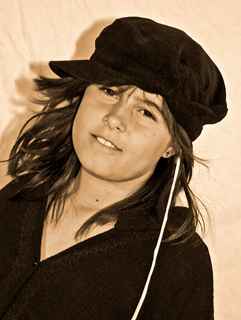
You chose a lovely model for your fashion entry and the sepia colors work nicely with the image's textures. I like the composition - the tilt - and I like the lighting on the model's skin....... but....
I think what hurts this image most is the harsh shadow behind your model. The solution is to move your model farther away from the bg surface or use a 2nd light behind her. Also the white line in the fg - ipod cord?? - is quite distracting. Since the viewer cannot see either end of it to determine what it actually is, it becomes a distracting element instead of a harmonic addition to the composition.
I hope these comments are found helpful and good luck with your future challenges.
Cindi |
|
 Photographer found comment helpful. Photographer found comment helpful. |
Comments Made During the Challenge  |
|
|
02/24/2006 07:16:19 PM |
| Very pretty model! I don't like the shadow behind her, but I like the shot. |
|
| Photographer found comment helpful. |
|
|
02/24/2006 03:52:17 PM |
| OK. I realize the white string thing is part of the outfit, but, man! It's seriously distracting! Also, I'm not too sure about the use of sepia toning with this one. I think color might have worked a little better. |
|
| Photographer found comment helpful. |
|
|
02/24/2006 03:47:50 PM |
| Her face is a bit dark, and the sepia tone doesn't fit the picture right. Also, the cord or white strip is the first thing I saw when I looked at the picture. |
|
| Photographer found comment helpful. |
|
|
02/24/2006 01:52:36 PM |
This is a casual portrait. I'm not seeing the fashion angle at all. Showing a trend in a photo (and a pretty tired trend at that) doesn't equal fashion photography. There is a certain feel to a fashion editorial. I don't expect the same level of quality as, say Vogue or Elle, but the spirit should be there in terms of composition and style. I have to be able to at least imagine seeing the photo in a magazine.
In terms of strict photographic merit this isn't too bad but it could be better. The white thing growing out of her head is very distracting. Sepia isn't working for me at all. The mood that sepia tends to impart doesn't have much to do with this subject matter---it seems like a random choice rather than a well-considered one. Next time, try placing your subject further away from the background to avoid the halo shadow effect. Better lighting and focus is needed to bring out more sparkle (or 'catch light) in her eyes which look very flat in this photo. |
|
| Photographer found comment helpful. |
|
|
02/24/2006 12:32:04 PM |
| The title and picture gives me nothing. Lightning is also very poor. |
|
| Photographer found comment helpful. |
|
|
02/23/2006 05:25:48 PM |
| I like the free feeling pose. The lighting could use some work and I'm not sure what that white string is, but for me, it would be a better image without it. |
|
| Photographer found comment helpful. |
|
|
02/23/2006 07:00:40 AM |
| Nice capture of a pretty young lady. Great facial expression and captivating eyes. Couple of distractions are holding this back. The wrinkled backdrop, and whatever that white thing is cutting across diagonally to her ear. |
|
| Photographer found comment helpful. |
|
|
02/22/2006 05:06:45 PM |
| I like the background and the shadow.. the model is lovely and her skin tones good. the white in the strap is distracting |
|
| Photographer found comment helpful. |
|
|
02/21/2006 11:30:05 PM |
| A bit too close at the background. But a nice portrait. |
|
| Photographer found comment helpful. |
Home -
Challenges -
Community -
League -
Photos -
Cameras -
Lenses -
Learn -
Help -
Terms of Use -
Privacy -
Top ^
DPChallenge, and website content and design, Copyright © 2001-2025 Challenging Technologies, LLC.
All digital photo copyrights belong to the photographers and may not be used without permission.
Current Server Time: 04/07/2025 09:28:08 PM EDT.