| Author | Thread |
|
|
10/03/2006 06:19:20 AM |
| I love the subtle colors, very elegant and beautiful |
|
 Photographer found comment helpful. Photographer found comment helpful. |
|
|
03/11/2006 01:15:56 PM |
These flowers so remind me of you my Kimberley and so address how I feel during the times you are departed from me.
I see their beauty but I cannot touch, nor feel, nor smell them, and life feels dull but there is still a distinctness that I can feel of you.
- Your Jason |
|
|
|
03/03/2006 07:27:20 AM |
from the Critique Club
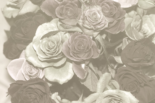
A couple of people understood, at least - though far more equally obviously didn't. How to be able to prevent that whilst still being able to submit work of this kind of quality seems a reasonable question.
First and most obviously I think your composition needs work. The suggested idea of filling the frame with flowers has a lot of merit, but also the composition is jumbled a slightly disorganised anyhow. I think you need to find a real focal point for things - that element of your image that you really want ot be the thing to hold the eye, and place that as strongly in frame as you can - the thirds 'rule' is an obvious route to take. Other approaches are to find elements that form lines, or strong shapes, and work your image around that. Also you might use your title more effectively - some mention of 'fade' or 'faded' perhaps might make it clear that this is intentional, without hitting the voters over the head with it.
However, perhaps a touch more care with your processing should be the most effective route. The entire look of this makes me think you've simply moved the black point and desaturated a touch. And of cours, it isn't a duotone, which hasn't helped your score. I get the impression that this isn't a completely serious entry - or at least not the main point. |
|
| Photographer found comment helpful. |
Comments Made During the Challenge  |
|
|
02/28/2006 06:40:33 PM |
| I love the fade and hope you don't get clobbered for low contrast. Elegant and subtle. Nice work. |
|
| Photographer found comment helpful. |
|
|
02/28/2006 09:02:30 AM |
| The contrast seems way off in this photo. |
|
| Photographer found comment helpful. |
|
|
02/26/2006 06:58:35 PM |
| a little less exposure time would bring out really nice contrasts |
|
| Photographer found comment helpful. |
|
|
02/26/2006 03:13:49 PM |
| I love this, No idea how you managed to get all those tones so softly hinted at. Very subtle. I'm guessing some might knock this, but not me. |
|
| Photographer found comment helpful. |
|
|
02/26/2006 09:33:59 AM |
| I like this photo....but I seem to be seeing more than just two tones in this photo. |
|
| Photographer found comment helpful. |
|
|
02/25/2006 01:41:13 PM |
| I like the hint of pink, but overall this picture is too washed out. |
|
| Photographer found comment helpful. |
|
|
02/25/2006 10:59:08 AM |
| Nice muted tones. I like the flowers too. I think it might look beter if the frame were filled completely with the flowers. Just a thought. |
|
| Photographer found comment helpful. |
|
|
02/24/2006 05:53:48 AM |
| Could use either more or less colour. |
|
| Photographer found comment helpful. |
|
|
02/23/2006 05:07:59 PM |
|
| Photographer found comment helpful. |
|
|
02/23/2006 02:51:35 AM |
|
| Photographer found comment helpful. |
|
|
02/22/2006 12:29:51 PM |
| Nice setup but the tones are just a bit too flat here. This shot has an almost transparent feel to it, my eye wants to be drawn into a rich and inviting setup of these roses but is just left wanting more. |
|
| Photographer found comment helpful. |
|
|
02/22/2006 03:40:42 AM |
|
| Photographer found comment helpful. |
Home -
Challenges -
Community -
League -
Photos -
Cameras -
Lenses -
Learn -
Help -
Terms of Use -
Privacy -
Top ^
DPChallenge, and website content and design, Copyright © 2001-2025 Challenging Technologies, LLC.
All digital photo copyrights belong to the photographers and may not be used without permission.
Current Server Time: 04/07/2025 09:01:28 PM EDT.