| Author | Thread |
Comments Made During the Challenge  |
|
|
02/25/2006 01:28:18 PM |
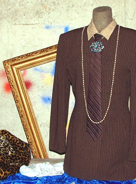
| good subject choices, and color |
|
 Photographer found comment helpful. Photographer found comment helpful. |
|
|
02/25/2006 09:09:05 AM |
| Cool idea and set up. Lighting is a bit harsh, making the blue and gold seem oversharpened. |
|
| Photographer found comment helpful. |
|
|
02/24/2006 07:28:42 PM |
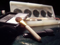
| This is a little busy. Stripes, Spots, splattered paint and something very shiny. I would've stuck with things with similar colors or patterns. |
|
|
|
02/24/2006 11:20:21 AM |
| I really don't like the background in this photo. And there's a lot going on in the immediate foreground that seems unnecessary. I think that if these items were arranged a little differently in front of a new background, this photo would be much more pleaseing to the eye. As it stands now, it really just looks like a bunch of 'stuff' thrown at the mannequin - there is no order to it, no sequence for the eye to follow. And the background just clashes with everything else. |
|
|
|
02/22/2006 05:19:26 AM |
| To the point and meets challenge, pic lacks luster but.... |
|
| Photographer found comment helpful. |
|
|
02/21/2006 11:24:51 PM |
| The lightning is realy flat. A direct flash is'nt flashy fashion. Nice setup thou. |
|
| Photographer found comment helpful. |
Home -
Challenges -
Community -
League -
Photos -
Cameras -
Lenses -
Learn -
Help -
Terms of Use -
Privacy -
Top ^
DPChallenge, and website content and design, Copyright © 2001-2025 Challenging Technologies, LLC.
All digital photo copyrights belong to the photographers and may not be used without permission.
Current Server Time: 04/07/2025 04:41:49 AM EDT.