| Author | Thread |
Comments Made During the Challenge  |
|
|
02/28/2006 12:51:45 PM |
|
 Photographer found comment helpful. Photographer found comment helpful. |
|
|
02/28/2006 08:28:31 AM |
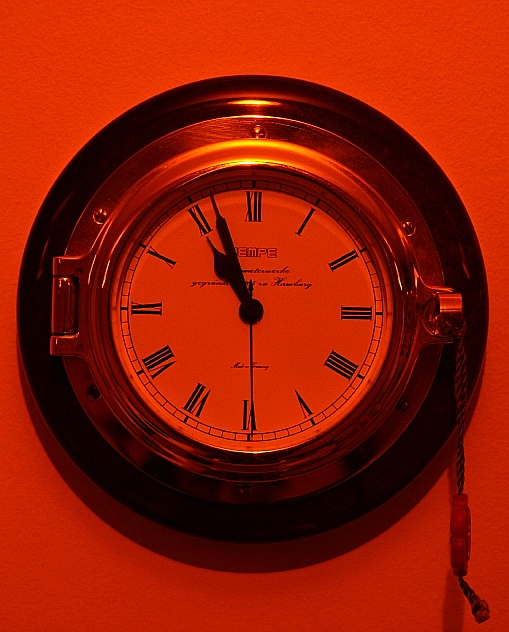
| I get where you are trying to go with the orange color, but it's just too harsh to me. |
|
| Photographer found comment helpful. |
|
|
02/27/2006 07:59:24 AM |
| I like the strong duotone colours, probably the richest in the challege. The subject isn't really interesting (to me), and a little grainy on the clockface. |
|
| Photographer found comment helpful. |
|
|
02/22/2006 06:01:00 PM |
| picture is good, the number four on the clock thought should be IV, according to the roman numerals, my daughter noticed this on a alot of the clocks, so now I do too. |
|
| Photographer found comment helpful. |
|
|
02/22/2006 09:39:46 AM |
| title is great - would have liked to see more light toning here as well as a more interesting POV. The toning can be achieved by desaturating and colorizing if using Photoshop. |
|
| Photographer found comment helpful. |
|
|
02/22/2006 08:19:19 AM |
| Extra points for taking a chance with color! |
|
| Photographer found comment helpful. |
|
|
02/22/2006 05:47:56 AM |
| Overall, the image is a little too orange. I love the crisp details. |
|
| Photographer found comment helpful. |
Home -
Challenges -
Community -
League -
Photos -
Cameras -
Lenses -
Learn -
Help -
Terms of Use -
Privacy -
Top ^
DPChallenge, and website content and design, Copyright © 2001-2025 Challenging Technologies, LLC.
All digital photo copyrights belong to the photographers and may not be used without permission.
Current Server Time: 04/07/2025 09:14:57 PM EDT.