| Author | Thread |
|
|
03/03/2006 06:21:01 PM |
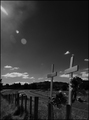
Greetings from the Critique Club...
I think this is an excellent image but I don't think the border you chose for it works particularly well. The white at the top leaves 'holes' in the overall composition. A black border would have done the same thing at the bottom of the image. There is a nice median that you may wish to try on something like this though. You could possibly create a 2 pixel white border around the original image and then add a black border. This would give you the separation you need. You could also reverse that idea and use a thin black border with white padding as well...
|
|
 Photographer found comment helpful. Photographer found comment helpful. |
Comments Made During the Challenge  |
|
|
02/27/2006 04:17:35 PM |
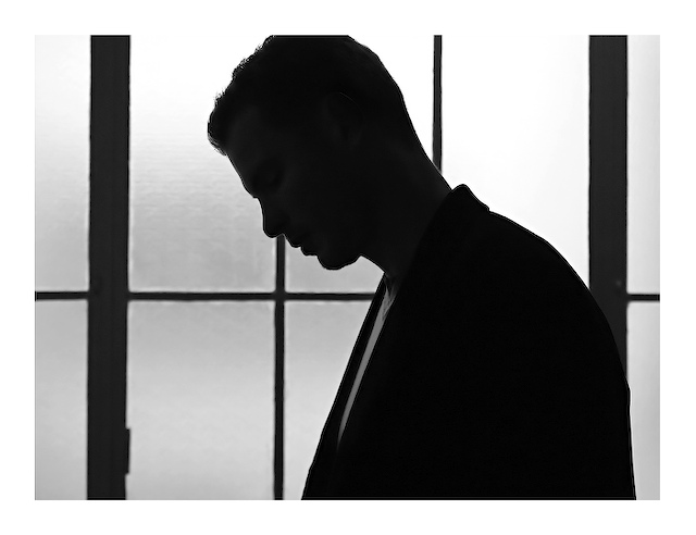
| Nice silhouette. I like the background, but I wish it was blurred a little more. |
|
| Photographer found comment helpful. |
|
|
02/25/2006 02:36:01 PM |
| This is gorgeous. THe mood that this sets is incredible. Great job! |
|
| Photographer found comment helpful. |
|
|
02/23/2006 08:05:11 PM |
| Very nice! Just would've liked to get rid of the crop on the top, especially since you chose an all-white frame. |
|
| Photographer found comment helpful. |
|
|
02/22/2006 10:01:39 PM |
| I really like this. The pose is humble and thoughtful. Nice and sharp too. |
|
| Photographer found comment helpful. |
|
|
02/22/2006 05:01:04 PM |
| nicely done. good crisp lines |
|
| Photographer found comment helpful. |
|
|
02/22/2006 11:07:22 AM |
| Would be better without border. |
|
| Photographer found comment helpful. |
Home -
Challenges -
Community -
League -
Photos -
Cameras -
Lenses -
Learn -
Help -
Terms of Use -
Privacy -
Top ^
DPChallenge, and website content and design, Copyright © 2001-2026 Challenging Technologies, LLC.
All digital photo copyrights belong to the photographers and may not be used without permission.
Current Server Time: 02/01/2026 08:13:49 AM EST.