| Author | Thread |
|
|
08/01/2003 01:28:11 PM |
*Critique Club*
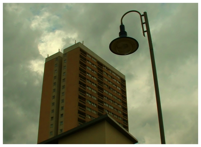
Very interesting photo. Has a gloomy feeling to it. I would have liked to see a little more light hitting the apartment building to show more detail in it.
As I look at it I would really like to see it without the lamp post.
It was a good concept on the challenge and a refreshing look at the subject of trends. Nicely done. |
|
 Photographer found comment helpful. Photographer found comment helpful. |
Comments Made During the Challenge  |
|
|
07/29/2003 04:15:52 PM |
|
| Photographer found comment helpful. |
|
|
07/29/2003 05:05:50 AM |
| Black and white might have worked better to bring out the gloom of the sky and the drab architecture of the building. |
|
| Photographer found comment helpful. |
|
|
07/28/2003 10:23:41 PM |
| Love this shot. Love it. Although, for some reason, my brain's saying to me, "Levels!" |
|
| Photographer found comment helpful. |
|
|
07/28/2003 08:56:11 AM |
| a 10. Moody, atmospheric and a little disturbing. Oh, and on subject too, which is unusual this week. |
|
| Photographer found comment helpful. |
|
|
07/28/2003 08:36:39 AM |
| Has the right sombre feel. The perspective (and wide angle lens, I guess) makes it look like the building's toppling (and a good thing that would be, too :-) |
|
| Photographer found comment helpful. |
|
|
07/28/2003 05:49:48 AM |
| The foreground choice of the lamp is an excellent with the building in the background. The clouds add drama to tehe picture. The little building in front of the larger one detracts from the shot however. Interesting concept. |
|
| Photographer found comment helpful. |
|
|
07/26/2003 10:13:15 AM |
| This photo is a little dark unforunatly. It's a good idea, but maybe could have been shot during a better part of the day? Good job. |
|
| Photographer found comment helpful. |
|
|
07/24/2003 05:53:15 AM |
|
| Photographer found comment helpful. |
|
|
07/23/2003 08:41:54 PM |
| I wish the light post wasn't there. Nice shot. |
|
| Photographer found comment helpful. |
|
|
07/23/2003 04:11:46 PM |
Questions I'm asking about this photograph: What does the lightpost add to the shot? Would there be a better way to portray urban housing other than with a photograph of a bland building? Maybe showing some scenes inside the building and the people who live there - so we could really see what the urban housing situation was like.
Lighting isn't that exciting and the building is underexposed because of the bright sky. |
|
| Photographer found comment helpful. |
|
|
07/23/2003 02:45:51 PM |
| Just wow, not much else to say. 9 |
|
| Photographer found comment helpful. |
|
|
07/23/2003 07:29:15 AM |
| Only if it was a bit less overcast |
|
| Photographer found comment helpful. |
|
|
07/23/2003 07:18:41 AM |
| Good choice of main subject.. But you've managed to get a contempary light stand in the shot.. |
|
| Photographer found comment helpful. |
|
|
07/22/2003 11:39:26 PM |
| Great title. The shot is a little murky-looking though - can't work out if this is on purpose or not. |
|
| Photographer found comment helpful. |
|
|
07/22/2003 11:19:10 PM |
|
| Photographer found comment helpful. |
|
|
07/22/2003 08:15:24 PM |
|
| Photographer found comment helpful. |
Home -
Challenges -
Community -
League -
Photos -
Cameras -
Lenses -
Learn -
Help -
Terms of Use -
Privacy -
Top ^
DPChallenge, and website content and design, Copyright © 2001-2025 Challenging Technologies, LLC.
All digital photo copyrights belong to the photographers and may not be used without permission.
Current Server Time: 04/07/2025 12:59:12 PM EDT.