| Author | Thread |
|
|
02/28/2006 12:28:01 PM |
from the tail-end of the Critique Club
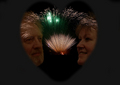
Although the challenge has the clear instruction to follow your - that is, your own, personal, interpretation of the word 'heart', nevertheless, in the eyes of the mass of voters here, that instruction is not to be followed too loosely. This a number of the comments you recieved - especially those referring to your title. Many people are enormously presumtious, not realising that some don't obsess about this place, aren't consumed with a sense of personal achievement from their average vote recieved and so on. I would advise that you don't be disheartened by it: those voices are usually not the ones that remain for the long haul.
However, there is the valid point that if this image is a good entry for this challenge, the exactly what kind of image is not? It's difficult ground, and perhaps not worth digging into too deeply. nevertheless, it is surely that element of things that has hurt your score here.
presuming that cosre isn't very interesting to you ... your main problem with this shot is, i think, either a function of your depth of field or the hand-held nature of it (if it isn't hand-held, why shoot at ISO 800?). It just isn't particularly detailed - not a sense of being out of focus, but rather of a slight motion blurring of most details. I'm sure your colour process hasn't helped, but equally sure that that isn't the only problem. There's also a slight sense pof distortion to the image: on closer examination, everything seeems to be parallel, and centred appropriate to such a graphic image, and yet something is certainly astray, and gives a sense of distortion to those supposedly staight lines.
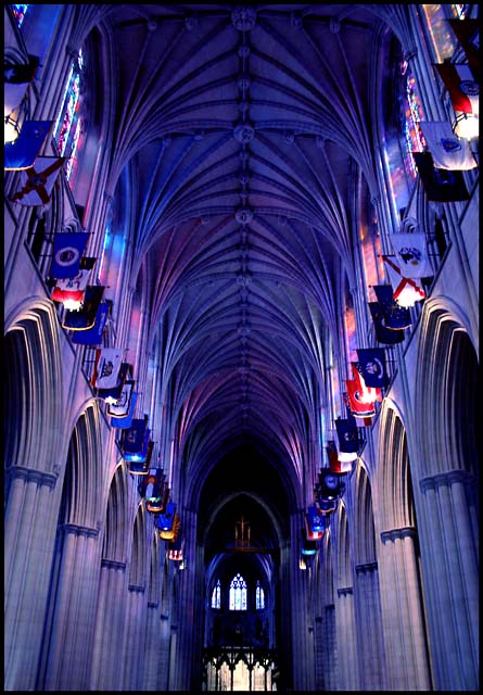
Personally, the image holds little interest for me: if it's an examination of the visula structure of the cathedral, then it has little new to offer, and if it's more than that then I fail to percieve the point. Fundamanetally, whatever processes have produced whatever interesting colours (not that I agree with that assessment), I don't finmd anything here to be very far removed from decent, technicaqlly assured architectural photography - but tath can be so much more than this presentation.
e |
|
 Photographer found comment helpful. Photographer found comment helpful. |
Comments Made During the Challenge  |
|
|
02/21/2006 06:49:56 AM |
| Okay. Interesting color and light. |
|
| Photographer found comment helpful. |
|
|
02/18/2006 09:45:43 PM |
Composition: 5
Technical: 5
Creativity: 5
Appeal: 5
Challenge: 1
Overall Score: 3, (weighted - NOT a calculated average)
Note: Click for info |
|
| Photographer found comment helpful. |
|
|
02/18/2006 05:19:22 PM |
| Thought the concept was a stretch for this challenge |
|
| Photographer found comment helpful. |
|
|
02/18/2006 05:02:38 PM |
| Closer than what? Closer than a parade of flags? Closer than the color blue? Closer than ever before? What a great shot. I would emphasize the monochromatic nature of this shot by cropping a half inch off the bottom, eliminating the yellow lighted portiong at bottom center. Then, the archway/windows at the end become almost a door at the end of a long tunnel. Gorgeous color on this, really. It's just the title that throws me. It comes off as a cheap shot, trying to squeeze a photo into a challenge where it doesn't really belong by use of a not-so-clever title. |
|
| Photographer found comment helpful. |
|
|
02/17/2006 06:10:23 AM |
| No heart, the voter is totally dependent upon the title to make the connection. You will probably score lower for that. |
|
| Photographer found comment helpful. |
|
|
02/16/2006 07:03:15 PM |
| nice study in perspective - interesting colors. |
|
| Photographer found comment helpful. |
|
|
02/15/2006 03:28:04 PM |
| Nice tones. There is a little too much noise. Could benefit from a noise reduction filter of some kind. I love the perspective. Great job. |
|
| Photographer found comment helpful. |
|
|
02/15/2006 12:08:24 AM |
| This is quite remarkable, and has wonderful leading lines..... This woulld have also been good for the "Heavenly Vertures" re Faith. |
|
| Photographer found comment helpful. |
Home -
Challenges -
Community -
League -
Photos -
Cameras -
Lenses -
Learn -
Help -
Terms of Use -
Privacy -
Top ^
DPChallenge, and website content and design, Copyright © 2001-2025 Challenging Technologies, LLC.
All digital photo copyrights belong to the photographers and may not be used without permission.
Current Server Time: 04/07/2025 01:15:48 PM EDT.