| Author | Thread |
|
|
07/30/2003 05:55:38 PM |
| Thanks for all the helpful comments. I've got a lot to learn; when the opportunity presented for a definite contrast, I snapped eventhough the UV rate was 10+. I've been reading some of the tips on resizing, but I'm afraid I still haven't got the hang of it. Any pointers would be greatly appreciated. |
|
Comments Made During the Challenge  |
|
|
07/27/2003 09:26:45 AM |
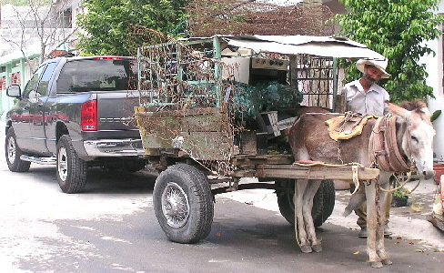
| What a great opportunity for this challenge. I think the picture is just a little overexposed and bright, but not a bad effort. Good luck |
|
 Photographer found comment helpful. Photographer found comment helpful. |
|
|
07/26/2003 02:54:52 PM |
| Contrast of theme instead of element, but I really enjoy how the textures contrast between the two vehicles. |
|
| Photographer found comment helpful. |
|
|
07/26/2003 08:43:15 AM |
| Good idea. As the colour is not very important this may have looked better in B+W. [7] |
|
| Photographer found comment helpful. |
|
|
07/24/2003 11:28:32 PM |
| Great capture. I don't know if it was possible or if it would have helped, but showng more of a straight on shot so that the truck was even more visible might have given more drama to the shot. |
|
| Photographer found comment helpful. |
|
|
07/24/2003 01:04:40 AM |
| My what a nice Arse you have here. Is that what you use to Pull the Dodge when it breaks down in the background. |
|
| Photographer found comment helpful. |
|
|
07/22/2003 11:35:17 PM |
| I like your contrasts in subject suits challenge well, my only criticism would be the lighting in front of truck is too bright. A mid-day shot I suspect. |
|
| Photographer found comment helpful. |
|
|
07/22/2003 10:58:12 PM |
| Good contrasting subjects. The image is hard to see because everything runs together - ironically, I think it could use more ocntrast. |
|
| Photographer found comment helpful. |
|
|
07/22/2003 01:45:58 PM |
| Like the concept and composition. would like the brightness down a bit. left area on the street is blown out |
|
| Photographer found comment helpful. |
|
|
07/22/2003 01:27:28 PM |
| Very pixalated. Learn more about resizing. I like the old man and donkey cart, hope you took some of them without the truck for your portfolio |
|
| Photographer found comment helpful. |
|
|
07/21/2003 09:23:55 AM |
| Nice idea; the framing seems a little obvious, and doesn't do much for the structural contrast of the two elements. Perhaps a touch or two over-exposed, and over-sharpened (lots of the lines have become jagged). |
|
| Photographer found comment helpful. |
|
|
07/21/2003 05:03:25 AM |
| great take on it- and nice catch |
|
| Photographer found comment helpful. |
|
|
07/21/2003 03:46:34 AM |
| Nice contracting image.. Overall the light looks too bright and the image seems to have been over-sharpened? |
|
| Photographer found comment helpful. |
|
|
07/21/2003 12:32:12 AM |
| The composition is nice, and the idea is great, but the overshaprened nature of the shot is detracting alot from it personally. It looks like it could have been made a bit bigger also. 6 |
|
| Photographer found comment helpful. |
Home -
Challenges -
Community -
League -
Photos -
Cameras -
Lenses -
Learn -
Help -
Terms of Use -
Privacy -
Top ^
DPChallenge, and website content and design, Copyright © 2001-2026 Challenging Technologies, LLC.
All digital photo copyrights belong to the photographers and may not be used without permission.
Current Server Time: 02/01/2026 12:02:30 PM EST.