| Author | Thread |
|
|
03/30/2006 02:19:10 AM |
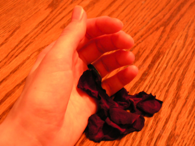
| I do like the "sketched" feeling of this photo - it looks as if it had been created with pastels or maybe colored pencils. Im wishing this hadnt been a basic editing challenge and the colors of the rose petals could have been kept closer to true rather than the orange tint - it would have given them more impact in the photo (thats just my personal opinion though and more artistic than technical at that). Good job! |
|
 Photographer found comment helpful. Photographer found comment helpful. |
|
|
03/17/2006 07:15:02 PM |
| Thanks everyone for the comments! The soft focus and the blending colors actually came through post processing, which I hadn't been very familiar with. Thanks for pointing out those problems. I know now what I could have done to get rid of them and will be trying to avoid these things in the future. More practice with Photoshop outside the realm of digital art has really helped. As for the wooden background, well, I've learned my lesson with that as well (that being, backgrounds are extremely important!). I am going to be thinking of ways that I can get some different good backgrounds - I read in a forum post that posterboard tends to do well. |
|
|
|
03/16/2006 06:50:22 AM |
| I like this, but I think it might be a little better if the petals were the primary shot of color. :) |
|
| Photographer found comment helpful. |
|
|
03/14/2006 08:33:09 AM |
| Nice sentiment and I think you're on the right track with the idea. The execution has a couple of areas that I would have tried to do a bit differently. One, the focus is a tad too soft IMHO. Yes, soft focus can create a nice romantic atmosphere/mood, but too much of it just looks oof - it's a fine line. Two, the background of the wood grain is distracting and too close to the same color tones as the woman's hand. A soft white material (cotton or silk) background might have worked a bit better and provided a better contrast to the hand & petals. Three, the crop is a bit tight on the top and bottom and loose on the sides. I'd try going for the rule of thirds and place the hand in the bottom left third. All in all, not a bad shot at all for your first challenge entry (much better than mine was!). Looks like you have a lot of promise and I look forward to seeing more of your work. |
|
| Photographer found comment helpful. |
|
|
02/28/2006 01:22:40 AM |
For your very first challenge entry, I do think you have done very well.....A really romantic & moving message here in this image.....
I love your subject matter, and if you listen to all the good advice, and learn, I know you will improve no end.....
Keep up the good work, and always ask questions if you are not sure of something as that is how I learn and improve..... |
|
| Photographer found comment helpful. |
Comments Made During the Challenge  |
|
|
02/21/2006 02:37:28 PM |
| I don't like the orange on orange - it does not appeal to me. The hand os lost in the background. - The idea is however interesting. |
|
| Photographer found comment helpful. |
|
|
02/20/2006 12:09:23 PM |
| THE CONTRAST COULD BE BETTER |
|
| Photographer found comment helpful. |
|
|
02/19/2006 11:36:02 AM |
| Oh my. Fix the lighting or colors next time. It'll be better. The wood background is very distracting too. |
|
| Photographer found comment helpful. |
|
|
02/18/2006 03:00:03 PM |
| Without the title, I don't see a "virtue". With the title, OK, but tenuous. The grain in the background doesn't add to this picture - it's too strong. And for some reason, the tips of the fingers appear transparent. |
|
| Photographer found comment helpful. |
|
|
02/18/2006 02:46:15 PM |
|
| Photographer found comment helpful. |
|
|
02/18/2006 06:40:05 AM |
| horrible lighting, alot of burning, the overly red cast is not helping the mood of the image either. lost alot of detail to slightly out of focus. the backdrop of the wood grain is unfortunate only because the colour tends to bleed into the hand, making your hand look like its made of wood? |
|
| Photographer found comment helpful. |
|
|
02/17/2006 04:24:35 PM |
| I like your concept and I think with a different light source (to reduce the orange look) and better focus, your image would be better - in my non-professional opinion. |
|
| Photographer found comment helpful. |
|
|
02/17/2006 02:57:20 PM |
| I don't see how this communicates the hope of awaiting a lover... |
|
| Photographer found comment helpful. |
|
|
02/16/2006 09:39:19 AM |
| looks very artificial to me |
|
| Photographer found comment helpful. |
|
|
02/16/2006 04:21:24 AM |
| Good concept, but I'd back off on the red so that the skin tones are more realistic. |
|
| Photographer found comment helpful. |
|
|
02/15/2006 12:25:28 PM |
| Oh dear, what happened to the colour? |
|
| Photographer found comment helpful. |
|
|
02/15/2006 08:58:22 AM |
| Composition is nice, but there are too much reds and yellows in this shot, WB needs some adjustments. |
|
| Photographer found comment helpful. |
|
|
02/15/2006 08:10:03 AM |
| beautiful portrayal of love... |
|
| Photographer found comment helpful. |
|
|
02/15/2006 05:46:33 AM |
|
| Photographer found comment helpful. |
Home -
Challenges -
Community -
League -
Photos -
Cameras -
Lenses -
Learn -
Help -
Terms of Use -
Privacy -
Top ^
DPChallenge, and website content and design, Copyright © 2001-2025 Challenging Technologies, LLC.
All digital photo copyrights belong to the photographers and may not be used without permission.
Current Server Time: 04/07/2025 01:40:34 PM EDT.