| Author | Thread |
Comments Made During the Challenge  |
|
|
02/21/2006 11:31:03 AM |
| missing the spoon.. but i like it |
|
|
|
02/21/2006 09:40:32 AM |
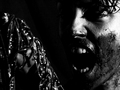
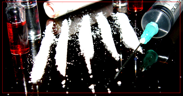
| This is a bit disturbing to look at but is a great tell all picture of evil.. |
|
|
|
02/20/2006 11:25:57 AM |
| VERY TRUE AND NICELY DONE |
|
|
|
02/19/2006 10:20:42 AM |
| Good take on the "7 Deadly Sins" theme. It seems that the contrast is a bit overdone, and the DOF is too shallow (the tip of the needle being out of focus for instance) |
|
|
|
02/19/2006 07:55:03 AM |
| Out of focus. Border is distracting. Composition isn't bad, idea is good. |
|
|
|
02/18/2006 11:32:45 PM |
Composition: 5
Technical: 4 - Whites are blown / overexposed
Creativity: 5
Appeal: 3
Challenge: 6
Overall Score: 4 - (weighted - NOT a calculated average)
Note: Click for info |
|
|
|
02/18/2006 07:03:26 PM |
| I think there's too much going on. I'd rather you picked one form and stayed with that. Also, I think the picture says enough on it's own; the border seems to try too hard. |
|
|
|
02/18/2006 04:33:09 PM |
|
|
|
02/18/2006 02:53:12 PM |
| edgy, but a little to busy for my taste. |
|
|
|
02/18/2006 06:26:55 AM |
|
|
|
02/18/2006 05:53:17 AM |
|
|
|
02/17/2006 08:22:38 AM |
| great photo - hope it is not real! |
|
|
|
02/16/2006 05:59:05 PM |
| Whites are blown, but good composition and a pretty good represenation of a deadly sin. |
|
|
|
02/16/2006 05:00:40 PM |
| Love the composition...personally I find myself wishing for more focus on the tip of the needle. |
|
|
|
02/16/2006 02:23:34 PM |
| contrast is a little high, not enough detail, needs more depth of feild. I have to look too hard to realize the content. Good subject for Gluttony! |
|
|
|
02/16/2006 02:14:18 PM |
| you look like you're equiped |
|
|
|
02/15/2006 09:41:03 PM |
| Nice composure, and colour. Personally I would have dropped the border. |
|
 Photographer found comment helpful. Photographer found comment helpful. |
|
|
02/15/2006 04:14:08 PM |
| Wish it weren't over exposed. |
|
|
|
02/15/2006 01:04:48 PM |
| Don´t like the red border. sorry |
|
|
|
02/15/2006 12:12:32 PM |
| Really hate the border, I find it very distracting. The cocaine is totally blown out. Nice idea, could have been better executed. |
|
|
|
02/15/2006 12:09:17 PM |
| that border is not working for me, but the shot is decent |
|
|
|
02/15/2006 10:49:44 AM |
|
|
|
02/15/2006 05:22:32 AM |
| i dont like the border but it is nice |
|
|
|
02/15/2006 04:24:27 AM |
| I don't really like the border much, and the whole frame looks a little over-exposed and out of focus. Nice choice of subject though. |
|
|
|
02/15/2006 12:11:58 AM |
| good idea, but over exposed |
|
|
|
02/14/2006 07:50:56 PM |
| the lines are a little too bright to me...but that's only my opinion! I think the border is great! the colors are nice too...8 |
|
| Photographer found comment helpful. |
Home -
Challenges -
Community -
League -
Photos -
Cameras -
Lenses -
Learn -
Help -
Terms of Use -
Privacy -
Top ^
DPChallenge, and website content and design, Copyright © 2001-2025 Challenging Technologies, LLC.
All digital photo copyrights belong to the photographers and may not be used without permission.
Current Server Time: 04/07/2025 01:13:07 AM EDT.