| Author | Thread |
Comments Made During the Challenge  |
|
|
07/26/2003 11:12:44 PM |
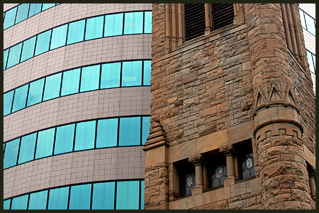
| One of my favorites for this challenge, I really love the juxtaposition of the wonderful old stone architecture and the very modern building. The colors work beautifully together, and your choice of composition works well to emphasize the tremendous difference. I am so glad that you left it color! Very nice shot! |
|
 Photographer found comment helpful. Photographer found comment helpful. |
|
|
07/26/2003 03:04:38 PM |
| Textures contrast well here in addition to your theme. |
|
| Photographer found comment helpful. |
|
|
07/25/2003 12:40:12 PM |
|
| Photographer found comment helpful. |
|
|
07/25/2003 08:17:41 AM |
| I'd have cropped the right edge I think. Nice viewpoint and it fits the challenge nicely too. Wonder if black and white would be good for this - it might emphasise the textures more? |
|
| Photographer found comment helpful. |
|
|
07/24/2003 12:14:51 PM |
| this is fab... the new and old .... good luck 10/10 |
|
| Photographer found comment helpful. |
|
|
07/24/2003 03:18:24 AM |
| hey, this is very similar to another shot. Awesome idea and perfect for this challenge. Great composition. |
|
| Photographer found comment helpful. |
|
|
07/22/2003 09:15:07 AM |
| The old seems out of focus, and I would thinkthe foreground should be the focused area. What does the scene look like in portrait? Great subject for challenge. 6 |
|
| Photographer found comment helpful. |
|
|
07/22/2003 06:53:14 AM |
| Very good contrast photo! This was the sort of pic I first thought of when I saw the new challenge topic, well done! |
|
| Photographer found comment helpful. |
|
|
07/21/2003 10:57:12 PM |
| Should have cropped out the new building on the right. There's no need for it, in fact it detracts from the message. Great idea, BTW. :) |
|
| Photographer found comment helpful. |
|
|
07/21/2003 10:03:39 PM |
| Very nice and certainly meets the challenge in my opionion. |
|
| Photographer found comment helpful. |
|
|
07/21/2003 11:34:07 AM |
| I see the example your showing here. I just don't like the composition. The right side could of been cropped more. |
|
| Photographer found comment helpful. |
|
|
07/21/2003 12:40:51 AM |
| A great entry; I think this would have been even stronger as a black and white. |
|
| Photographer found comment helpful. |
Home -
Challenges -
Community -
League -
Photos -
Cameras -
Lenses -
Learn -
Help -
Terms of Use -
Privacy -
Top ^
DPChallenge, and website content and design, Copyright © 2001-2026 Challenging Technologies, LLC.
All digital photo copyrights belong to the photographers and may not be used without permission.
Current Server Time: 02/01/2026 11:24:37 AM EST.