| Author | Thread |
Comments Made During the Challenge  |
|
|
07/22/2003 06:35:03 PM |
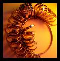
| Lighting looks a bit harsh for this subject. |
|
 Photographer found comment helpful. Photographer found comment helpful. |
|
|
07/21/2003 07:05:10 PM |
| Could the edge of the floor or table or base have been removed by moving the umbrellas back a bit so that you could crop it out? The only polish needed on a interesting and well executed shot. |
|
| Photographer found comment helpful. |
|
|
07/19/2003 11:16:59 AM |
|
| Photographer found comment helpful. |
|
|
07/16/2003 07:48:18 PM |
| Nice...good light, colour, composition. My only nipick is the edge at the bottom. I'd knock it out, personally. It's curved (might be pincushioning from the lens) and distracts. The scene would appear much more stable without it. |
|
| Photographer found comment helpful. |
|
|
07/16/2003 06:58:17 AM |
| I don't like your use of harsh overhead lighting. I would have preferred softer, more diffused lighting which would have brought out the colors better too. Also, I don't think you should have shown the end of the table at the bottom of the image. |
|
| Photographer found comment helpful. |
|
|
07/15/2003 09:41:07 PM |
| Too much light on the top to my taste. |
|
| Photographer found comment helpful. |
|
|
07/15/2003 08:49:54 PM |
| blue's just a little blown out, which is maybe an angle of the light thing to correct for. |
|
| Photographer found comment helpful. |
Home -
Challenges -
Community -
League -
Photos -
Cameras -
Lenses -
Learn -
Help -
Terms of Use -
Privacy -
Top ^
DPChallenge, and website content and design, Copyright © 2001-2025 Challenging Technologies, LLC.
All digital photo copyrights belong to the photographers and may not be used without permission.
Current Server Time: 04/07/2025 11:07:35 AM EDT.