| Author | Thread |
Comments Made During the Challenge  |
|
|
02/14/2006 07:20:02 AM |
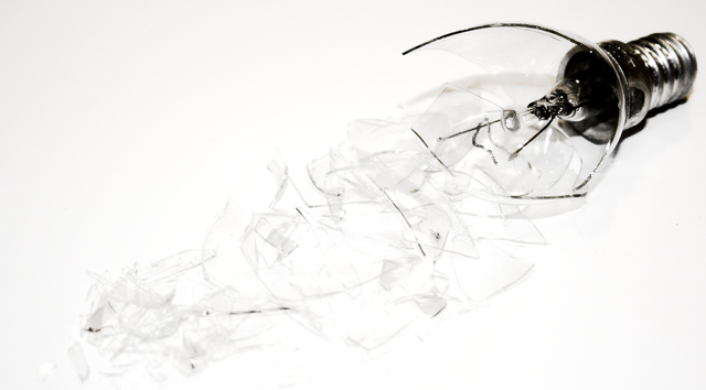
| too much light ..this cause me to give u only 3 |
|
 Photographer found comment helpful. Photographer found comment helpful. |
|
|
02/12/2006 11:09:53 PM |
| The title makes no sense to me. |
|
| Photographer found comment helpful. |
|
|
02/11/2006 05:54:23 PM |
| Good photo, but I think the glass would have been more noticeable if this was on a black background. |
|
| Photographer found comment helpful. |
|
|
02/10/2006 02:58:11 AM |
| Would have been interesting to see a version without such a strong high-key effect |
|
| Photographer found comment helpful. |
|
|
02/09/2006 10:13:16 PM |
| Cool composition! I would have liked to see some more life in the broken galss though, it blends too much with the bakground for me. It might be your goal, but I find that it reduces the overall image. |
|
| Photographer found comment helpful. |
|
|
02/09/2006 09:55:40 AM |
|
| Photographer found comment helpful. |
|
|
02/09/2006 02:38:51 AM |
| Not enough contrast, can't see the shattered glass all that well. |
|
| Photographer found comment helpful. |
Home -
Challenges -
Community -
League -
Photos -
Cameras -
Lenses -
Learn -
Help -
Terms of Use -
Privacy -
Top ^
DPChallenge, and website content and design, Copyright © 2001-2025 Challenging Technologies, LLC.
All digital photo copyrights belong to the photographers and may not be used without permission.
Current Server Time: 04/07/2025 01:34:52 PM EDT.