| Author | Thread |
|
|
02/18/2006 11:06:32 AM |
| I truly loved this image. As I read through the coments I saw where people said it had been done before. I think it is hard to do purely original photography. There is not much that hasn't been done. I look forward to trying to capture this image in my own way. As far as it placing 16th there have been many remakes of music that have topped the chart when performed by another artist. Thank you for the inspiration. |
|
 Photographer found comment helpful. Photographer found comment helpful. |
|
|
02/08/2006 12:03:42 PM |
| 16th????? I thought this had been done 500 times before! :) |
|
| Photographer found comment helpful. |
|
|
02/08/2006 04:28:13 AM |
| 16th????? I thought this one would be on for a winner |
|
| Photographer found comment helpful. |
Comments Made During the Challenge  |
|
|
02/07/2006 11:05:51 PM |
| Good photo, great creativity. |
|
| Photographer found comment helpful. |
|
|
02/07/2006 09:28:23 PM |
|
| Photographer found comment helpful. |
|
|
02/07/2006 07:40:08 PM |
| hey, nwo this is a clever shot. Fantastic composition! |
|
| Photographer found comment helpful. |
|
|
02/07/2006 06:38:16 PM |
| Great photo. Creativity gets an A+. |
|
| Photographer found comment helpful. |
|
|
02/07/2006 04:37:36 PM |
| This was great... I'd love to see this photgraph taken with a Bible passage, though. Of course, I'm just that way. |
|
| Photographer found comment helpful. |
|
|
02/07/2006 01:58:29 PM |
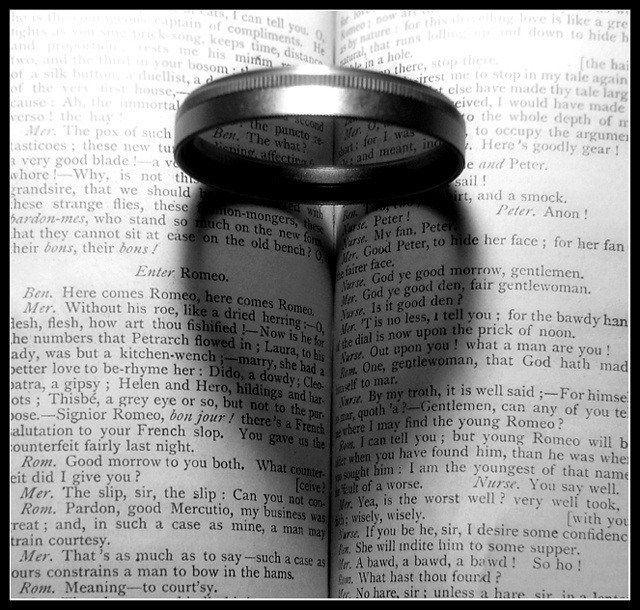
| I really like the use of the unknown shape. It give me the feeling of finding love where you least expect it. |
|
| Photographer found comment helpful. |
|
|
02/07/2006 01:16:50 PM |
|
| Photographer found comment helpful. |
|
|
02/07/2006 01:16:36 PM |
| Simply excellent. How much more romantic can you get than Romeo and Juliet? THEN you add the heart with a few minutes of thought. It's the perfect image for the theme. |
|
| Photographer found comment helpful. |
|
|
02/07/2006 12:52:53 PM |
A bit grainy and a little washed out on my monitor at least. But I like
the idea. |
|
| Photographer found comment helpful. |
|
|
02/07/2006 10:54:22 AM |
| This is a great photo. I love the image created by the shadow. A well thought-out setup. |
|
| Photographer found comment helpful. |
|
|
02/07/2006 10:06:13 AM |
this for me is the winner!!
excellent idea!! (10) |
|
| Photographer found comment helpful. |
|
|
02/07/2006 03:59:37 AM |
| a little overexposed, but excellent concept - 9 |
|
| Photographer found comment helpful. |
|
|
02/06/2006 10:06:38 PM |
| Great attempt at this shot. The b&w seems to work well. |
|
| Photographer found comment helpful. |
|
|
02/06/2006 06:28:52 PM |
| nice shot. Very different. |
|
| Photographer found comment helpful. |
|
|
02/06/2006 03:56:16 PM |
|
| Photographer found comment helpful. |
|
|
02/06/2006 01:56:14 PM |
A little too similar to:
//www.dpchallenge.com/how.php?HOW_ID=36 |
|
| Photographer found comment helpful. |
|
|
02/06/2006 03:12:28 AM |
| I'm sure everyone and their brother is gonna say this, but, ummm... already been done?? and a tutorial//www.dpchallenge.com/how.php?HOW_ID=36?? |
|
| Photographer found comment helpful. |
|
|
02/06/2006 12:30:18 AM |
So far this is my favorite image of the challenge. Excellent use of lighting, obviously.
Editted much later to add that I just saw the Love ribbon winners which probably served as inspiration. Still, very nice shot. |
|
| Photographer found comment helpful. |
|
|
02/05/2006 11:52:06 PM |
| Way too clever. I thought I'd found the number 1, blue ribbon earlier, but you officially have mine anyway. Great photo! |
|
| Photographer found comment helpful. |
|
|
02/05/2006 06:23:44 PM |
I would have never expected to see the word "fishified" in this challenge. The text and title are well chosen, but the execution of this shot is not as strong as the shots that it tries to mimic. A more well-defined shadow (and if possible, less blown-out text in the background) would make this a sure ribbon winner.
Even as currently shot, you probably could have adjusted curves to bring back a lot of the over-exposed areas and to increase the contrast in the shadows. Graphicfunk did a nice write-up on adjusting curves in this thread. |
|
| Photographer found comment helpful. |
|
|
02/05/2006 03:10:11 AM |
| very creative idea and good exposure, well done |
|
| Photographer found comment helpful. |
|
|
02/04/2006 09:17:51 PM |
|
|
|
02/04/2006 06:57:14 PM |
|
| Photographer found comment helpful. |
|
|
02/03/2006 07:08:28 PM |
|
| Photographer found comment helpful. |
|
|
02/03/2006 05:39:23 PM |
| Gee I think I have seen this before |
|
| Photographer found comment helpful. |
|
|
02/03/2006 12:52:16 PM |
| Idea already seen, but realization appreciated |
|
| Photographer found comment helpful. |
|
|
02/03/2006 11:16:27 AM |
|
| Photographer found comment helpful. |
|
|
02/02/2006 11:39:52 PM |
gee, thats never been done before.....
still a good shot though |
|
| Photographer found comment helpful. |
|
|
02/02/2006 10:31:08 PM |
| this is amazing... absolutley amazing. How did you get the ring to make the heart? wow.. im so amazed...<3 |
|
| Photographer found comment helpful. |
|
|
02/02/2006 03:15:19 PM |
|
| Photographer found comment helpful. |
|
|
02/02/2006 01:57:10 PM |
| WOW:)) gr8 gr8 gr8 idea, a 10 |
|
| Photographer found comment helpful. |
|
|
02/02/2006 01:03:25 PM |
| Clever idea! ...but where is Juliet?...:) |
|
| Photographer found comment helpful. |
|
|
02/02/2006 12:07:56 PM |
|
| Photographer found comment helpful. |
|
|
02/02/2006 12:03:46 PM |
| Good idea. I wonder if the colour version might work better in this particular case. |
|
| Photographer found comment helpful. |
|
|
02/02/2006 11:16:07 AM |
| Wow...very cool idea. Well executed...only complaint is the overexposed area at the top. |
|
| Photographer found comment helpful. |
|
|
02/02/2006 10:19:06 AM |
| Like this alot nice form of the heart in the middle!! |
|
| Photographer found comment helpful. |
|
|
02/02/2006 09:07:54 AM |
Act 2, Scene II would have a better choice where Romeo, in his famous soliloquy, enters and makes this declaration into the morning mists when, in her radient beauty, Juliet suddenly appears at her window...
"But, soft! what light through yonder window breaks?
It is the east, and Juliet is the sun."
Now THAT is romance! |
|
| Photographer found comment helpful. |
|
|
02/02/2006 07:15:14 AM |
| Thats wonderful! What a clever idea. 8 |
|
| Photographer found comment helpful. |
|
|
02/02/2006 06:45:29 AM |
| I love how the heart shape has appeared by standing the filter on the book... An excellent photo I say! |
|
| Photographer found comment helpful. |
|
|
02/02/2006 06:13:59 AM |
| this has been done before...needs an original idea |
|
| Photographer found comment helpful. |
|
|
02/01/2006 10:30:30 PM |
| very very creative i'd say takes an eye to see this beautiful thing |
|
| Photographer found comment helpful. |
|
|
02/01/2006 10:14:42 PM |
| Really creative...love it. |
|
| Photographer found comment helpful. |
|
|
02/01/2006 09:54:59 PM |
| Excellent idea. A bit overexposed and needs additional DOF so ring is in focus. |
|
| Photographer found comment helpful. |
|
|
02/01/2006 08:29:06 PM |
|
| Photographer found comment helpful. |
|
|
02/01/2006 05:35:15 PM |
| The top of the text is blown and the uppermost part of the filter is outside the focal range. The idea is a classic (i.e. used alot but still good) and I like the clever use of the text and the centerness. Rotated square and with more carefull lighting would have helped a nice image score better |
|
| Photographer found comment helpful. |
|
|
02/01/2006 12:46:45 PM |
| Been done to death so no points for originality. Frankly this isn´t very well done technically speaking either, the filter itself out of focus, the harsh lighting causing glare on top of it and also some bad glares on the pages towards the upper corners. Anyway, sorry but for an unoriginal shot that isn´t terribl well done technically I only give a 4. No offense meant of course. Also, I encourage you to keep at this, looking at images that have been done to death and then imitating them but then put your own little twist on them, just do something different and funky so don´t let my comment discourage you. |
|
| Photographer found comment helpful. |
|
|
02/01/2006 10:55:45 AM |
| Great idea! Too bad that the upper corners are over-exposed |
|
| Photographer found comment helpful. |
|
|
02/01/2006 10:45:22 AM |
| Perfect! I love the creativity! |
|
| Photographer found comment helpful. |
|
|
02/01/2006 06:15:23 AM |
| Nice take on this type of shot - I like the choice of book. The hot spot on the filter is distracting and also it would be better with a great dof so the filter was not so blurred. |
|
| Photographer found comment helpful. |
|
|
02/01/2006 06:07:31 AM |
| well done! that looks so cool! |
|
| Photographer found comment helpful. |
|
|
02/01/2006 01:20:03 AM |
| Nice shot :) I like the idea of having the shadow on Romeo & Juliet. I think the lighting at the top it a little too bright tho. |
|
| Photographer found comment helpful. |
Home -
Challenges -
Community -
League -
Photos -
Cameras -
Lenses -
Learn -
Help -
Terms of Use -
Privacy -
Top ^
DPChallenge, and website content and design, Copyright © 2001-2026 Challenging Technologies, LLC.
All digital photo copyrights belong to the photographers and may not be used without permission.
Current Server Time: 02/01/2026 11:46:01 AM EST.