| Author | Thread |
|
|
02/13/2006 07:11:01 PM |
Greetings from the Critique Club
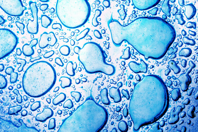
I like the idea, the shapes made create a very nice abstract. The lighting is a bit harsh from the middle to the left but perfect on the right side. The shadows made on that side are very interesting. The color makes this true to challenge but is just a tad flat. I think the biggest thing that throws me on this picture is the lack of main subject, my eyes keep dancing around trying to pinpoint what it is you want me to see. With all the curves and lines made, it really creates good motion but it doesn't lead anywhere. I believe for this challenge and these voters, its a bit too abstract (and a great one at that).
|
|
Comments Made During the Challenge  |
|
|
02/07/2006 02:45:44 AM |
| This is good, actually very good..... |
|
|
|
02/05/2006 03:52:38 PM |
|
|
|
02/05/2006 06:31:10 AM |
nice idea remindes me a little of this shot. good luck!  |
|
|
|
02/05/2006 02:02:59 AM |
|
|
|
02/03/2006 05:38:20 AM |
| Seems overexposed and quite unnatural. I can't really see the point of composition here, the subject of your photo. Indeed it's blue, but blue should be a likely feature of your subject or tell us some more about the subject you choose. I think the purpose of the colour is important in this challenge. |
|
|
|
02/02/2006 07:14:41 AM |
| I don't know what this is but its strange looking. |
|
|
|
02/02/2006 03:45:30 AM |
|
|
|
02/01/2006 02:24:32 PM |
| slightly overexposed but nice shot |
|
Home -
Challenges -
Community -
League -
Photos -
Cameras -
Lenses -
Learn -
Help -
Terms of Use -
Privacy -
Top ^
DPChallenge, and website content and design, Copyright © 2001-2025 Challenging Technologies, LLC.
All digital photo copyrights belong to the photographers and may not be used without permission.
Current Server Time: 04/09/2025 08:59:26 PM EDT.