| Author | Thread |
|
|
05/10/2006 02:46:45 PM |
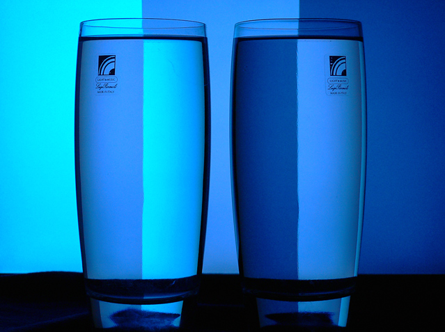
| There are a couple of things that would have helped this image. First it would be nice if the blue extended all the way to the bottom of the frame. The glasses could stand to be in sharper focus. And finally, I think the shades of blue are a little to close to one another. It would have made the image much more contrasty with a slightly wider range of the three shades. All that being said, you still did fairly well in the challenge and with a little tweaking this could go from a good image to a great one. |
|
 Photographer found comment helpful. Photographer found comment helpful. |
Comments Made During the Challenge  |
|
|
02/06/2006 06:17:48 PM |
| Been done a million times - I also would have removed the labels from the glasses... |
|
| Photographer found comment helpful. |
|
|
02/06/2006 01:50:52 AM |
| Nice execution. After seeing this style of image here I�ve always wanted to give it a try. |
|
| Photographer found comment helpful. |
|
|
02/05/2006 03:45:17 PM |
| not sure about the logos on the glasses...but great shot...hope this does well for you |
|
| Photographer found comment helpful. |
|
|
02/03/2006 01:43:32 PM |
|
| Photographer found comment helpful. |
|
|
02/02/2006 02:45:25 PM |
| isn't this geting a bit tierd? |
|
| Photographer found comment helpful. |
|
|
02/02/2006 08:34:39 AM |
| Were you planning on bringing the glasses back? I'm not sure what the stickers are adding. I'd also prefer there were some true whites in the picture somewhere rather than an entirely blue cast. Nicely aligned though. |
|
| Photographer found comment helpful. |
|
|
02/01/2006 07:07:20 AM |
| The original has straight lines. The lighning look nice, though. |
|
| Photographer found comment helpful. |
|
|
02/01/2006 06:08:26 AM |
| A cliche, but nicely done. I whis you peeled off those stickers from the glasses. |
|
| Photographer found comment helpful. |
|
|
02/01/2006 04:26:17 AM |
| Very nice but I am wondering why you didn't take the stickers off the glasses....very distracting and really takes away from the simplicity and cleanness of the shot. |
|
| Photographer found comment helpful. |
|
|
01/31/2006 10:53:12 PM |
| Classic style of image, very nicely executed. Not sure if I'd prefer it with the stickers removed from the glasses. |
|
| Photographer found comment helpful. |
|
|
01/31/2006 10:04:43 PM |
| logos and unstraight horizon line are distracting in an otherwise very good shot |
|
| Photographer found comment helpful. |
Home -
Challenges -
Community -
League -
Photos -
Cameras -
Lenses -
Learn -
Help -
Terms of Use -
Privacy -
Top ^
DPChallenge, and website content and design, Copyright © 2001-2025 Challenging Technologies, LLC.
All digital photo copyrights belong to the photographers and may not be used without permission.
Current Server Time: 04/07/2025 01:01:29 AM EDT.