| Author | Thread |
|
|
02/12/2006 02:29:24 PM |
::: Critique Club :::
Hi, my name is Kari and from the critique club.
First Impression - the most important one:
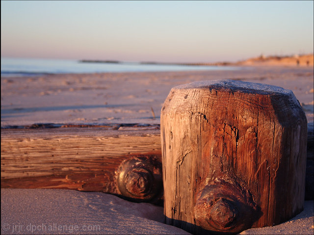
Lovely colours, with an interesting perspective. What a take on the challenge. Did you happen upon this or did you set it up ...
Composition:
Well composed with great use of DOF ... the details of the wood is fantastic ... and it looks like you can touch it.
Subject:
Defiantely meets my idea of a off centred.
Technical (Colour and light):
Nature provides us with fantastic lighting ... and you have made the most of this.
To grow its vote?:
You are in a tough challenge here, and I think this shot did really well, to grow .. perhaps look at the cropping, but don't panic is really quite unreal.
Summary:
The comments you have received reflect the different emotions and feelings that have been evoked from this shot .. great work.
If you've got any questions about this critique, please feel free to contact me via the PM system.
Cheers
Kari |
|
Comments Made During the Challenge  |
|
|
02/04/2006 04:02:03 PM |
| Great detail and textures in the timbers..... |
|
 Photographer found comment helpful. Photographer found comment helpful. |
|
|
01/31/2006 09:48:30 AM |
| This reminds me of something that David Nightengale over at www.chromasia.com would take a picture of. If you live near this beach, a long look over the last year of his blog could give you some serious inspiration for beach (and other) photography. I like this well enough colors/contrast and comp wise, but I think some more sharpness on the stump would really punch this up a bit more. Picky bit, your horizon it tilted to the right a little. Speaking of, I'm not sure that the horizon added to the photo really and you might have done better to take a top down angle gander at this. I'm seeing hints of patterns in that sand that are much more compelling to me than the flat and un-interesting (possibly distracting even) horizon/sky. Sorry, I just had a lot to say. Hope this helped. |
|
| Photographer found comment helpful. |
|
|
01/30/2006 04:25:04 PM |
| Colors and composition, very good...........(9) |
|
| Photographer found comment helpful. |
|
|
01/29/2006 08:53:08 PM |
| beautiful light...would have liked just a smidge more on the bottom |
|
| Photographer found comment helpful. |
Home -
Challenges -
Community -
League -
Photos -
Cameras -
Lenses -
Learn -
Help -
Terms of Use -
Privacy -
Top ^
DPChallenge, and website content and design, Copyright © 2001-2025 Challenging Technologies, LLC.
All digital photo copyrights belong to the photographers and may not be used without permission.
Current Server Time: 04/08/2025 01:34:44 AM EDT.