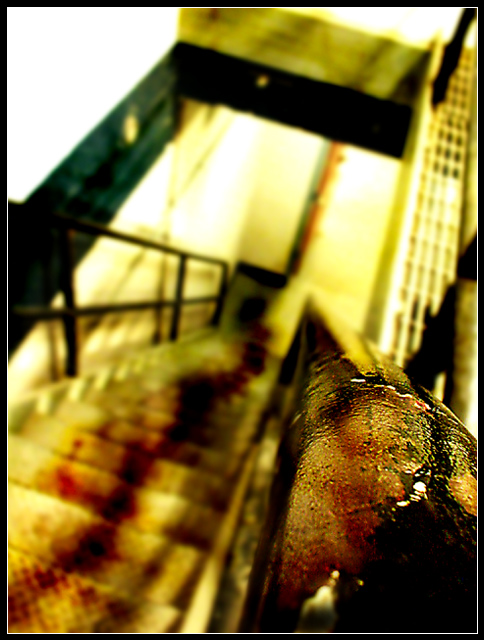
Lots of curves, levels, slight USM on the railing, Gaussian blur overall and erased it closer to the foreground for clearer focus. Lots of burning on the stairs to bring out the 'bloodstain'.
I have no idea how to predict what kind of voting I'll get on this...personally I really love this shot, it's the kind of gross and dirty thing I like to do, but eh. Go at it, fickle voters.
This is the basement of one of the buildings here, the stairs lead up to the foundry where I have my welding class.
Very interesting image, I like creative approaches, unusual angles, and shallow DOF, and am not afraid of dark material (some of mine is quite dark too). The image has grown on me as I looked at it, but for some reason it doesn't feel quite "right" to me.
Firstly, the top of the handrail is the obvious first point of interest, both because of its prominence in the frame and the focus/shallow DOF. However, I didn't perceive bloodstains on there initially, and even after reading others' comments mentioning them I don't perceive them there strongly. So the initial area grabbing interest is an interesting macro shot of wear-and-tear on a handrail, not a bloodstained handrail. Is the largish dark patch in the corner supposed to be blood? It just looks dark to me.
In light of this, the OOF bloodstains on the stairway itself are not obvious, and only get attention later - in other words, my eyes keep getting drawn AWAY from the element that seems to be the most important one.
Secondly, it took me a while to perceive the bloodstains on the stairway as blood, and even after viewing for some time I don't get a STRONG sense of that. I'm not 100% sure why, but I think it looks to me like the stairway is an industrial metal one, but the bloodstains look like they're soaking-into-carpet bloodstains not sitting-on-metal blood - so at a semi-conscious level, it feels not quite right, which reduces the impact.
So, overall, the idea is great, but the execution doesn't seem to quite do it justice. It's a good image, but I think there's a better image sitting in there. Some suggestion/approaches:
- If the dark patch in the lower right corner is blood, you need to bring out a bit more shadow detail, plus some meniscus and light-reflections to make it look more liquid.
- Emphasise the bloody finger marks on the handrail more strongly.
- "Less is more" might be worth considering on the blood marks on the stairway - less blood that stands out with a bit more pattern (smaller pools that show someone has walked through it, rather than pools that look to have dried).
- A slightly different angle - just the stairs, not the handrail itself (as a focus of interest) - position the camera at the top of the stairs, looking down at a similar angle, with the first stair with blood in sharp focus (again narrow DOF), the other stairs blurred as is - gives stronger emphasis on the "dragging down".
I am new here and relatively so to serious photography; so, I will offer only my response, not a critique.
Oh my, this is tough. It's compelling conceptually and something I want to review again. The detail on the top rail is an unqualified sucess. The apparent blood down the stairs is suggestive, brought into focus by the title. That's the point then isn't it. Would I have gotten it without the title? Subliminally, the message is there. The shifted focus puts the artistic element of the piece into strong contention. I must give you the nod and put my slight preference for greater clarity on at least one stair, to the side of art. Very nice.
Wow is this some crime scene... blood on the carpet? I love the diagonal composition and shallow dof but I'm not sure what it is that's in focus. The top of the handrail with bloodstains? That's what it looks like to me. It's a good photo and I like it... it's unusual here at dpc and I hope folks appreciate it. 8