| Author | Thread |
|
|
10/03/2005 12:11:34 PM |
|
Comments Made During the Challenge  |
|
|
07/15/2003 07:46:31 PM |
|
|
|
07/15/2003 02:51:19 PM |
| interesting concept on flashing... |
|
|
|
07/14/2003 12:17:45 PM |
|
|
|
07/11/2003 10:08:41 PM |
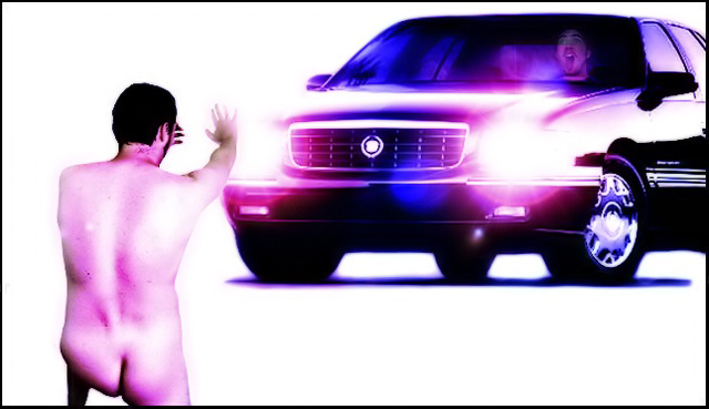
| I don't "get it", but regardless, I think it's phenomenally effective, creative, well-composed and eye-catching. Goes to prove sometimes you just don't have to "get it". This also would have done well in the unanswered questions challenge. 9 |
|
 Photographer found comment helpful. Photographer found comment helpful. |
|
|
07/11/2003 03:34:35 PM |
| I can't really figure out what you were going for here.. but I don't think the result is aesthetically effective. The purple tint throws off the feel of the shot, the cutout on the body seems a bit rough in spots, and the shot as a whole has a sort of advertisement style, but the style doesn't seem to fit the content at all. There really seems to be some idea that you were going for here, but it's just not all coming together very well for me. |
|
| Photographer found comment helpful. |
|
|
07/11/2003 06:46:04 AM |
| I'm not sure I understand the title in regards to the photo but I'm sure you had fun putting this together. Good luck in the challenge. |
|
| Photographer found comment helpful. |
|
|
07/11/2003 05:35:40 AM |
| Something about that left buttock makes this look very unnatural. I like the expression on the car driver's face though! |
|
| Photographer found comment helpful. |
|
|
07/11/2003 04:23:28 AM |
| That is hillarious. My as well use photoshop to its full potential. Jacko. 8 |
|
| Photographer found comment helpful. |
|
|
07/11/2003 03:12:45 AM |
| I have no idea what the deeper meaning of this picture is, but it's very effective nonetheless. The stark white background works well, the glare from the headlights is effective, nice lighting on the car. Good post-processing. 8 |
|
| Photographer found comment helpful. |
|
|
07/11/2003 02:50:45 AM |
| couldn't see the relevance of the title.. looks too much like two images put together.. might not be but that's how it looks.. lefthand side of the nude looks a little weird.. shape of buttock.. something not quite right |
|
| Photographer found comment helpful. |
|
|
07/10/2003 11:30:38 PM |
| the edtiing needs work - it's a lttle choppy. the idea is creative (which i like) even though I'm not sure i get it (and I like to think I'm one of the ones who usually gets things). The perspective is a bit off as well, but in a shot like this I'm not sure that matters. Creativity outweighs the rest. nice job. |
|
| Photographer found comment helpful. |
|
|
07/10/2003 11:24:25 PM |
| A cool shot, but the guy on the left looks anything but natural. Cool piece of artwork, but I think you've gone way beyond photography - which (despite it being legal for this challenge), puts me off. Cool to see at least one male nude so far, though. |
|
| Photographer found comment helpful. |
|
|
07/10/2003 10:00:04 PM |
|
| Photographer found comment helpful. |
|
|
07/10/2003 08:50:41 PM |
| This is intresting. Looks like a Cadilac ad with a naked guy in it! ;) |
|
| Photographer found comment helpful. |
Home -
Challenges -
Community -
League -
Photos -
Cameras -
Lenses -
Learn -
Help -
Terms of Use -
Privacy -
Top ^
DPChallenge, and website content and design, Copyright © 2001-2025 Challenging Technologies, LLC.
All digital photo copyrights belong to the photographers and may not be used without permission.
Current Server Time: 04/07/2025 01:00:39 PM EDT.