| Author | Thread |
Comments Made During the Challenge  |
|
|
01/29/2006 11:18:10 PM |
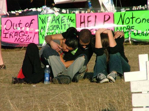
| a little interest, but appears like a shot for a newspaper. The horizon line is off |
|
|
|
01/28/2006 08:12:17 PM |
I'm not allowed to write a political comment.
I'm not allowed to write a political comment.
I'm not allowed to write a political comment.
I'm not allowed to write a political comment.
I'm not allowed to write a political comment.
I'm not allowed to write a political comment.
I'm not allowed to write a political comment.
I'm not allowed to write a political comment.
I'm not allowed to write a political comment.
I'm not allowed to write a political comment.
I'm sorry for the wasted space |
|
|
|
01/28/2006 07:48:46 PM |
| nice color, comp ok, b&w need work, light flat, texture ok, overall not interesting |
|
|
|
01/28/2006 04:03:02 PM |
| The subjects in this photo are too centered, the reflection off of the posters is distracting if you had moved to the left or right and taken the shot at an angle this would have been improved significantly. |
|
|
|
01/26/2006 02:20:01 PM |
| I don't think you have maximised the potential of this shot, as it is a lot smaller than entries are allowed to be. The crop also seems really quite centred. Is an emotional shot, which appeals to a lot of people, but just needs a tweak to work a little better. |
|
|
|
01/26/2006 05:24:16 AM |
| Quite emotional and comforting... |
|
|
|
01/22/2006 05:16:15 PM |
|
|
|
01/21/2006 01:12:38 PM |
|
|
|
01/20/2006 10:39:58 AM |
|
|
|
01/20/2006 10:33:31 AM |
| Wonderful sentiment, though not the strongest portrayal of it. And not a very good photograph. My-son-the-marine has only 16 days left of his four years of service. It has been a long four years for a Mom. He has close friends who have died and lost limbs. I'm so glad that you had the courage to enter this statement. Unfortunately it is not as clear as it could be. I was going to comment that the pizza boxes on the right were distracting but then realized they are crosses. The sun glare on the signs is a DPC nono, as is the slight tilt of the horizon. When the subject is placed in the center like this, it is less interesting than one placed off center. However, I am going to give you a 10 for guts and for my 21 year old son who survived and his buddies who did not. |
|
|
|
01/19/2006 07:25:32 PM |
| This would make a good photojournalism photo. I find the white bit in the foreground distracting though, and I think you should have used the full 640px size. |
|
|
|
01/19/2006 07:04:46 PM |
| Political feelings aside... This could have been a stronger image with a little more cropping. My suggestion would be eliminate more of the foreground, and zero in on the clasped hands with the signs as BG. The bench on the right is also distracting. |
|
|
|
01/19/2006 02:06:42 PM |
| an O.K. political statement, but the photo comes off as being a little staged, and not very technically proficient. The composition is too centered and dull, the neon coloring of the signs is distracting and gaudy, and the grave markers in front are too cut out, and only serve to look out of place (and hard to determine). |
|
|
|
01/17/2006 10:14:21 AM |
|
|
|
01/17/2006 10:11:55 AM |
| nice photojournalism... however with advanced editing rules i would have cropped in a bit closer and removed (cloned out) distracting white objects at front |
|
Home -
Challenges -
Community -
League -
Photos -
Cameras -
Lenses -
Learn -
Help -
Terms of Use -
Privacy -
Top ^
DPChallenge, and website content and design, Copyright © 2001-2026 Challenging Technologies, LLC.
All digital photo copyrights belong to the photographers and may not be used without permission.
Current Server Time: 02/01/2026 11:42:45 AM EST.