| Author | Thread |
Comments Made During the Challenge  |
|
|
01/28/2006 12:38:13 PM |
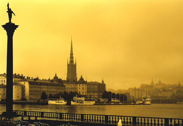
| I don't care for the yellow cast to the sky. That is my personal opinion. Otherwise it is a lovely travel photo. |
|
 Photographer found comment helpful. Photographer found comment helpful. |
|
|
01/27/2006 08:41:48 PM |
|
| Photographer found comment helpful. |
|
|
01/26/2006 09:55:08 AM |
| As a person that knows this location very well having lived in Stockholm for 6 years I simply have to say that I don´t think the yellow tone does this scene any justice, sorry... Just wanted to explain why I only gave it a 4, I figured I owed you that. |
|
| Photographer found comment helpful. |
|
|
01/26/2006 06:47:57 AM |
| Unusual color tones, but they works well in this cityscape... |
|
| Photographer found comment helpful. |
|
|
01/24/2006 07:46:52 AM |
| My home town :D. This is a very nice duotone (?) in fact; the entire tonal range is used quite effectively. I would definately have at least tried to clone out that white "thing" in the foreground, whatever it is, as it distracts a LOT from the rest of the image. |
|
| Photographer found comment helpful. |
|
|
01/22/2006 01:13:10 PM |
| Nice image but too yellow for my liking. |
|
| Photographer found comment helpful. |
|
|
01/21/2006 10:30:20 PM |
| Hey can i paint this, i have been thinking of some stuning compositions, i guess this fits it very well. if i paint it will show you the painting, |
|
| Photographer found comment helpful. |
|
|
01/21/2006 10:23:41 AM |
| there seems to be a ever so slight tilt to the left .... |
|
|
|
01/20/2006 07:33:11 AM |
| Interesting. Looks like an old, faded postcard! |
|
| Photographer found comment helpful. |
|
|
01/20/2006 05:41:04 AM |
|
| Photographer found comment helpful. |
|
|
01/18/2006 04:56:30 AM |
| Nice photo, however I'm not at all keen on the bright yellow tinting you gave it. |
|
| Photographer found comment helpful. |
|
|
01/17/2006 12:45:24 PM |
| I like this color, good and strong. Makes the photo timeless. |
|
| Photographer found comment helpful. |
|
|
01/17/2006 11:35:50 AM |
hmm... i like the image but not the tone, maybe a traditional sepia would have been better, and a little grundge and contrast would make it look like an old print.
as far as the image goes very clasic. well done in the taking not the making. |
|
| Photographer found comment helpful. |
|
|
01/17/2006 05:10:59 AM |
| Reminds me of a old postcard. |
|
| Photographer found comment helpful. |
|
|
01/16/2006 08:32:03 AM |
| My favorite city :) I used to live about 15 mins walk from this spot. Lovely composition and the coloring works surprisingly well. |
|
| Photographer found comment helpful. |
|
|
01/16/2006 05:23:37 AM |
| Wow...I love what you did with the hue of this pic. Totally looks like an old postcard from the early part of the 20th century. |
|
| Photographer found comment helpful. |
|
|
01/15/2006 10:43:31 PM |
| Nice color work. The fog adds a moody air of mystery to this photo. It's hard for me not to feel like the pillar on the left unbalances the composition. |
|
| Photographer found comment helpful. |
Home -
Challenges -
Community -
League -
Photos -
Cameras -
Lenses -
Learn -
Help -
Terms of Use -
Privacy -
Top ^
DPChallenge, and website content and design, Copyright © 2001-2025 Challenging Technologies, LLC.
All digital photo copyrights belong to the photographers and may not be used without permission.
Current Server Time: 04/07/2025 01:10:38 PM EDT.