| Author | Thread |
|
|
07/21/2003 11:36:12 PM |
*critique club*
Overall
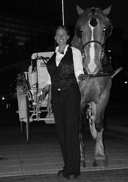
This photo meets the challenge well. You've captured a romantic night on the town. I wonder if you're making a pun, too - a Knight with steed and wench in tow? Certainly, the imagination is allowed to run loose here. This is in stark contrast to the quite rigid poses of the models, who appear relaxed enough but somewhat off balance. Usually, it's better to have models look at the camera in a posed shot. Here, ironically, it's the human who's looking away.
Composition
I don't like the white pole extruding from the human's head. It seems to accentuate the straightness of her body negatively. Also, being the brightest thing in the shot, it draws the eyes away from the key elements. The human is bang in the middle but looking through to the left. The horse is on the right but looking directly ahead. There seems to be an unbalance of objects, then. The horse's direct gaze calls for more space to work within. With the woman looking expectantly at something outside the photo and the horse at the camera, I feel rather that the photo loses a lot of its impact. The bright spots in the eyes also reinforce this imbalance.
Your f-stop is wide, but the carriage is clear, meaning that the dof is deeper than I think you had imagined. Certainly, the camera angle downplays any import for the carriage in this shot. Being out of focus would have helped your composition somewhat. If you wanted a sharp carriage, maybe you should have taken a shot further from the left. That might have pulled the inquisitive horse's eyes round to match the woman's, too. While doing so, you might correct the horizon, too.
Colour
I find the overall colour range too much on the dark side. Checking with Photoshop, I found that (except the pure white pole) most of the important body parts, eyes, face, teeth, even the arms, were in the 17% - 70% grey range. With b&w, you really need to push the tonal boundaries more, especially with potentially dark shots like this. Find the point which you can accept as being the brightest, then work backwards from there. (The white spots in the horse's eye are 100% white, a feature totally missing in the girl, which accounts for some of the problems there.)
To sum up, more tonal contrast, more thought about the composition and more consideration about the dof and you'll have a great shot. As it stands, this one is one worthy of re-doing, don't you think?
Best wishes,
Jim
|
|
 Photographer found comment helpful. Photographer found comment helpful. |
Comments Made During the Challenge  |
|
|
07/15/2003 05:12:51 AM |
| Too posed...she lookes like she is forcing the smile..good shot of horse but don/t like the lights in eyes |
|
|
|
07/14/2003 09:59:16 AM |
| Kinda closely cropped, and she has a spear in her head, a better angle might have helped it. Also needs to be straightened 5 |
|
| Photographer found comment helpful. |
|
|
07/13/2003 08:02:49 PM |
| I think this picture would have been more effective if it weren't taken straight away head on. I would have liked to have seen more of the carriage which would have provided more interest and would have helped tell a story. The horse has the B&W equivalent of red-eye and the woman has the horsewhip extending out of her head. I think there are many ways of having had this subject show a "night out on the town," but you chose to make more of a snapshot of it. |
|
| Photographer found comment helpful. |
|
|
07/11/2003 08:09:57 PM |
|
|
|
07/11/2003 04:19:57 PM |
|
|
|
07/11/2003 12:14:07 AM |
| ALWAYS use a pretty girl to add points to your photo! Seriously, though, the photo is pretty good except for two things I saw. The pretty girl has a white rod sticking out of the top of her head, and the horses eyes look evil (or something). The horses eyes are a lighting problem, and the white rod could be alleviated by changeing the angle of your shot, which could have been better anyway if you could have shown more of the cart. |
|
| Photographer found comment helpful. |
|
|
07/10/2003 02:46:28 PM |
| Not sure I like the black and white, possibly could benefit from a little more contrast. |
|
| Photographer found comment helpful. |
|
|
07/10/2003 10:46:27 AM |
| Too dark. Her shirt becomes the focal point of the shot. Also, I'm not sure if you intended to have the photo "lean" but it seems to and in this case, it doesn't work too well for me. |
|
| Photographer found comment helpful. |
|
|
07/10/2003 07:26:36 AM |
| Your smile lightened the hurt of every boy :-) Nice photo!!! |
|
|
|
07/09/2003 07:18:44 PM |
| pulled by The Steed of Satan Dratted flash... |
|
|
|
07/08/2003 09:50:14 PM |
| I bet you wish you could spot edit the horses "white eye", good photo, and good idea for the challenge. |
|
| Photographer found comment helpful. |
Home -
Challenges -
Community -
League -
Photos -
Cameras -
Lenses -
Learn -
Help -
Terms of Use -
Privacy -
Top ^
DPChallenge, and website content and design, Copyright © 2001-2025 Challenging Technologies, LLC.
All digital photo copyrights belong to the photographers and may not be used without permission.
Current Server Time: 04/07/2025 01:06:41 PM EDT.