| Author | Thread |
|
|
01/21/2006 06:45:45 PM |
Greetings from the Critique Club
by strangeghost
TECHNIQUE
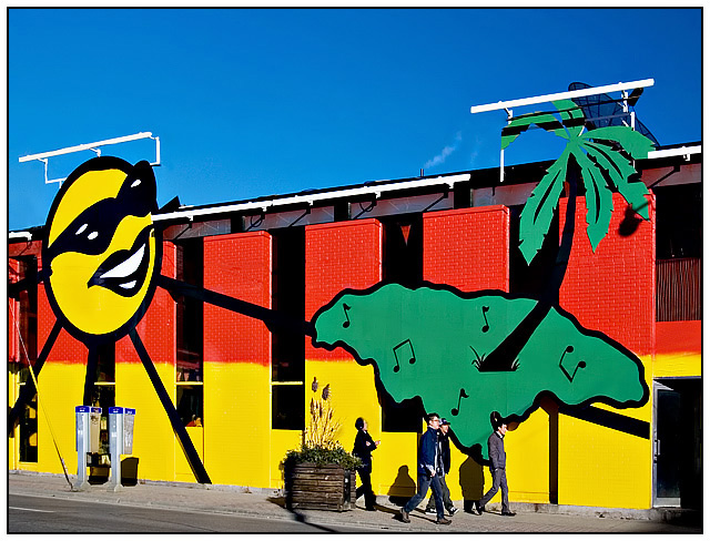
Technically excellent though I think the colors may be a bit too saturated. They certainly do pop but because of the range of primary colors, it's all a bit overwhelming! Good job handling the exposure with the combination of bright sunlight, blue sky, and vibrant paints.
COMPOSITION
This is where this pic loses some points - for me. The perspective is a little awkward. The angles made by the street/sidewalk lines on the bottom and the building/sky at the top both lead awkwardly and sort of aimlessly to the right side of the photo, not really leading anywhere. I think you may have fallen prey to the temptation to cram too much into one photo. The people walking are competing with the colorful elements of the building itself. What is the intended subject? It probably should be the people. In that case, my advice is to get closer. Get as close as you can, and then move in, as the saying goes. In a perfect world, what would I have done differently? I guess I would have squared up the perspective and isolated a part of the painted mural, maybe the big smiley face at upper left, and then attempted to catch the passersby right as they passed underneath. Or something to that end. Whatever, I think less would have been more in this case.
EMOTIONAL IMPACT
It certainly is colorful, and technically well done, as I said above. However, it seems to lack emotional punch. I think giving the people more of a central role in the photo would have helped in this regard immensely.
Well, people didn't have that much to say during the challenge, but those who commented certainly seemed to appreciate it. Your final score of 5.89 is above average, but I still think this could have been a killer shot if more careful thought and attention had been given to composition. It's certainly a respectable shot and one I hope you're happy with. I certainly enjoyed the chance to study it closely. |
|
 Photographer found comment helpful. Photographer found comment helpful. |
Comments Made During the Challenge  |
|
|
01/14/2006 04:53:30 PM |
| Very nice choice of subject. You did a nice composition, especially to hide unwanted elements (the dish). Your patience for people to be in it gives it some perspective of size. Well done. |
|
| Photographer found comment helpful. |
|
|
01/13/2006 08:33:37 PM |
| Back for comments. Great shot. Perfect choice of background for this challenge. |
|
| Photographer found comment helpful. |
|
|
01/13/2006 08:22:03 AM |
| WOW. what a burst of colors in this wall. Nice. 7 |
|
| Photographer found comment helpful. |
|
|
01/12/2006 07:54:19 PM |
| Nice candid. Love the urban and eclectic feel of this shot. |
|
| Photographer found comment helpful. |
|
|
01/12/2006 05:21:47 AM |
| Beautiful, Love the idea. I've never seen such a colorful building, how fun. Nice composition. |
|
| Photographer found comment helpful. |
|
|
01/11/2006 08:37:35 PM |
|
| Photographer found comment helpful. |
|
|
01/09/2006 05:51:55 PM |
| Wow, very cool building. I feel like those people should be carrying guitars or something. Reminds me of a 1960's - 1970's album cover. 10 |
|
| Photographer found comment helpful. |
|
|
01/08/2006 07:19:50 PM |
| Hey, this is pretty cool. I love the high contrast colors |
|
| Photographer found comment helpful. |
Home -
Challenges -
Community -
League -
Photos -
Cameras -
Lenses -
Learn -
Help -
Terms of Use -
Privacy -
Top ^
DPChallenge, and website content and design, Copyright © 2001-2025 Challenging Technologies, LLC.
All digital photo copyrights belong to the photographers and may not be used without permission.
Current Server Time: 04/08/2025 01:46:44 AM EDT.