| Author | Thread |
Comments Made During the Challenge  |
|
|
01/17/2006 05:04:54 PM |
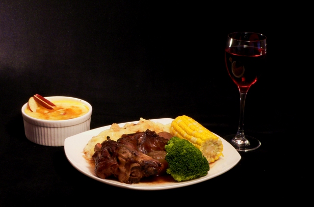
| slightly out of focus and needs to be cropped slightly more |
|
 Photographer found comment helpful. Photographer found comment helpful. |
|
|
01/15/2006 02:08:58 AM |
| The whitish on the left side is spoiling it. I'd like it better if cropped to have more of the subjects in the image and less black background. even if it had cropped some of the dishes. |
|
| Photographer found comment helpful. |
|
|
01/14/2006 08:58:14 PM |
| Love the use of neutral black space to highlight the image |
|
| Photographer found comment helpful. |
|
|
01/14/2006 05:59:01 PM |
| This is one of the better ones as it look good enough to eat..... |
|
| Photographer found comment helpful. |
|
|
01/14/2006 08:59:19 AM |
| Bad title. For me the composition is a little wierd. What would have happened if the glass were moved between the two dishes? I think you would have gotten a tighter crop and a more prominent presentation. Also I do not like the lighting on the wine. 6 |
|
| Photographer found comment helpful. |
|
|
01/14/2006 04:43:55 AM |
| The title puts me off - otherwise nice contrasts, colours and composition. I particularly like the dark background. |
|
| Photographer found comment helpful. |
|
|
01/13/2006 07:06:17 PM |
| Good idea, especially the usage of a black background and the wine. The background would be best if it were uniformly black everywhere but grey shows up on the far left. Additional lighting to make the wine glass stand out more would be a good addition. The image seems a bit on the soft focused side when increasingly hungry reviewers want to see |
|
| Photographer found comment helpful. |
|
|
01/12/2006 08:06:07 AM |
| Nice, not fond of the all black background, Glass is almost lost in the black. |
|
| Photographer found comment helpful. |
|
|
01/11/2006 01:02:40 PM |
| The wine glass gets lost in the black background too much. Looks like a good homestyle family dinner! (But where's the silverware?) |
|
| Photographer found comment helpful. |
|
|
01/11/2006 11:32:50 AM |
|
| Photographer found comment helpful. |
|
|
01/11/2006 08:42:39 AM |
| Nice arrangement. Wish that it were sharper and that the glass were lit. |
|
| Photographer found comment helpful. |
|
|
01/11/2006 08:24:20 AM |
|
| Photographer found comment helpful. |
|
|
01/11/2006 03:28:56 AM |
| Black background doesn't seem to work, particularly with the wine glass. |
|
| Photographer found comment helpful. |
|
|
01/10/2006 10:52:13 PM |
|
| Photographer found comment helpful. |
|
|
01/10/2006 10:35:08 PM |
| to dark background so you got 2 |
|
| Photographer found comment helpful. |
|
|
01/10/2006 09:40:42 PM |
| Get closer. Let us see the texture. The enormity of the black background is distracting. |
|
| Photographer found comment helpful. |
|
|
01/10/2006 08:09:42 PM |
| The wine is lost over there. |
|
| Photographer found comment helpful. |
Home -
Challenges -
Community -
League -
Photos -
Cameras -
Lenses -
Learn -
Help -
Terms of Use -
Privacy -
Top ^
DPChallenge, and website content and design, Copyright © 2001-2025 Challenging Technologies, LLC.
All digital photo copyrights belong to the photographers and may not be used without permission.
Current Server Time: 04/07/2025 01:21:42 AM EDT.