| Author | Thread |
|
|
09/27/2003 05:56:54 PM |
| thanks a lot for all your helpful comments! |
|
|
|
07/22/2003 06:42:20 AM |
*Critique Corner*
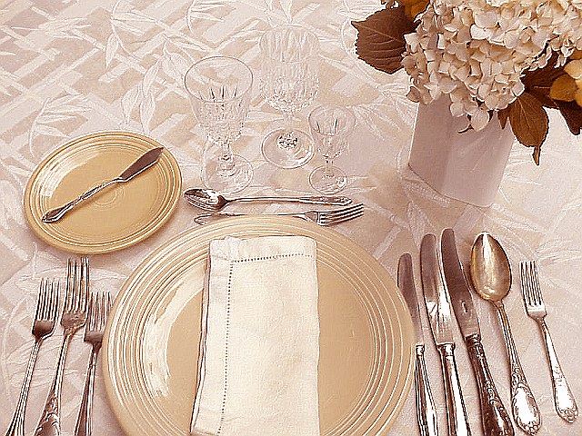
It is a very pretty image the table looks so nice. But it really doesn't say a lot about a night on the town, it says a formal dinner well though.
Your focus is very good but there is a strong glare coming off the plate, and the one crystal goblet appears to blend into the tableclothe.
Your composition here is very good and there are a number of possibilities here you just need to concentrate a little more on the little minor details and you will have an outstanding photo.
Anna |
|
 Photographer found comment helpful. Photographer found comment helpful. |
Comments Made During the Challenge  |
|
|
07/15/2003 06:49:17 PM |
| I really like this photo, but it almost seems too sharp, or there is some compression loss in the image. Great concept though. Love the colour ranges you have used, and the composition is very nice! |
|
| Photographer found comment helpful. |
|
|
07/15/2003 05:02:41 AM |
| Would be a lot nicer if the silverware wasn't tarnished and somewhat dirty looking |
|
|
|
07/14/2003 09:28:25 PM |
| To shot the silver stuff you need to use a filter (a white acrylic is enough) because it is easy to look like "yellow stuff" (sometimes gold) rather tan silver, and it takes the colors of the background too... try it, it works... |
|
| Photographer found comment helpful. |
|
|
07/13/2003 06:24:23 PM |
| Looks like a fun meal coming up. Everything is very shiny and seems to loose detail. Maybe candle light to tone down the harshness. |
|
| Photographer found comment helpful. |
|
|
07/11/2003 10:51:11 PM |
| Would have been much better if it were darker, or even black and white. Still - amazing compsition. 6. |
|
| Photographer found comment helpful. |
|
|
07/11/2003 08:25:53 PM |
| creative concept. It's different. I like it. |
|
| Photographer found comment helpful. |
|
|
07/10/2003 09:38:40 PM |
| beautifully captured. i love the colors. elegant. but a bit too set up and artificial. maybe dim the lights, bring out the candles, and pour some wine. :o) |
|
| Photographer found comment helpful. |
|
|
07/10/2003 08:48:15 PM |
this does say dinner. so it is night life. The crop seems a little tight and the light to bright. a candle or two would have made this work better for me.
Message edited by author 2003-07-16 00:06:37. |
|
| Photographer found comment helpful. |
|
|
07/10/2003 11:26:45 AM |
| NIce to see an unusual range of tones - even the silver is brown-ish. 7. |
|
| Photographer found comment helpful. |
|
|
07/10/2003 10:23:10 AM |
| I like the colors and the theme, but I think with the crystal blending in so well with the pattern of the linens, there seems to be a little too much unused space at the top left. This makes the whole shot feel unbalanced. I would also like to see the bottom of the plate and silver not cut off since those really are the focal point in the shot. Interesting and unique idea for this challenge. |
|
| Photographer found comment helpful. |
|
|
07/10/2003 08:01:54 AM |
| wish the crop hadn't been so severe at the bottom.. good to have seen the bottom of the plate. Seems a little over sharpened as well.. nice idea 5 |
|
| Photographer found comment helpful. |
|
|
07/10/2003 07:05:48 AM |
| this didnt meet the challenge at all, blah blah blah, im sure youve heard that 100 times already so i wont get into that. other than that what i would have done was had a black tablecloth so the glasses would stand out more and maybe have taken the shot from a different angle, this one seems a bit uninteresting, maybe set the camera down on the table and taken it from the left side to right, do you know what im talking about? oh well whatever. |
|
| Photographer found comment helpful. |
|
|
07/09/2003 12:29:46 AM |
| nice colors. However, the elements in the picture seem to need more space. A bit crowded, IMO. |
|
| Photographer found comment helpful. |
|
|
07/08/2003 11:57:50 PM |
| I don't like how you crop the image ... You should have crop a little less so the dish would be more visiable. |
|
|
|
07/08/2003 11:54:14 PM |
| The glasses disappear into the background and there's too much glare off the cutlery for my liking. Nice try but doesn't work imo. |
|
| Photographer found comment helpful. |
|
|
07/08/2003 11:23:53 PM |
| Certainly formal, but awfully oversharpened as well. Make sure you use your Unsharp Mask with finesse and care! (2) |
|
|
|
07/08/2003 11:15:34 PM |
| feels like there's a lot of sharpening done to this picture? otherwise I kinda like it tho :) |
|
| Photographer found comment helpful. |