Hi! Here�s a comment from the Critique Club.
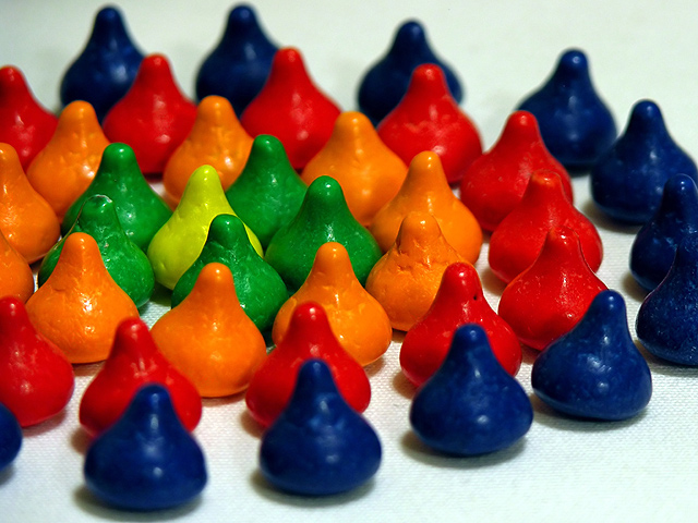
First Impression: Nice color, lots of color�too much color. Eyes are drawn to the green ring and then orange, red and blue.
Composition: Given the vivid colors, the image is a little busy. Two rings with a center may have been more effective. In this case less may have been better.
Subject: Think you met the challenge, definitely a burst of color!
Technical: Very good colors, very vivid. Nice lighting. Excellent focus. Sharp detail. Material kisses are sitting on has some distracting colors. Outside the blue ring, there is a blue tone. As you go inside the blue ring it goes much whiter, and material texture is more prominent. Texture is due to DOF, not sure why there was a color shift.
Suggestions: As this was a �studio shot� Try with fewer rings. See if there is more impact, or take a wider shot. Don�t crop so close
Summary: Nice picture, lots of color with sharp detail.
|