| Author | Thread |
Comments Made During the Challenge  |
|
|
01/28/2006 12:25:10 PM |
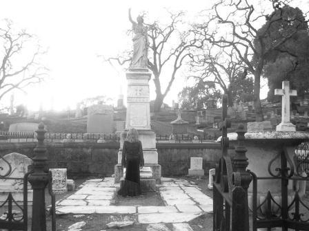
| This image doesn't have the impact that I think you were looking for. It is too centered and too far from the girl to convey the emotions of grief and longing. |
|
|
|
01/26/2006 05:19:33 PM |
| Very nice composition, however, the photo is too white washed/over-exposed for me... |
|
|
|
01/26/2006 12:48:45 AM |
|
 Photographer found comment helpful. Photographer found comment helpful. |
|
|
01/23/2006 01:49:28 PM |
| The small size of image makes it difficult to assess. The image is over-exposed - thus the sky blown out. Seems to have a lot of noise too. |
|
| Photographer found comment helpful. |
|
|
01/22/2006 02:15:46 AM |
| I think the photo is a bit too small, and also seems to be very overexposed in the sky. |
|
| Photographer found comment helpful. |
|
|
01/21/2006 11:24:31 PM |
| This doesn't grab me; and I think it is because it is so flat, and the lady looks like a tourist and not a mourner. |
|
| Photographer found comment helpful. |
|
|
01/21/2006 11:40:32 AM |
Use of the full 640 pixel limit is highly recommended.
Other than that, I don't really like the bright light in this. |
|
| Photographer found comment helpful. |
|
|
01/20/2006 11:11:07 AM |
| This picture could be so powerful with more contrast and without the distracting blown out sky. 6 |
|
| Photographer found comment helpful. |
|
|
01/19/2006 08:03:48 AM |
The message of the image has some merit. Some problems I see:
- you're shooting right at the sun, so the glare is very harsh
- it's too small and looks pixel-y
- the composition is overly busy (could you have gotten closer and to the side?)
- the grey tones are overly dominant here (some editing on contrast may have helped)
Hope this helps. |
|
| Photographer found comment helpful. |
|
|
01/18/2006 05:24:22 PM |
| 8 from me....a little too washed out and seems slightly blurry...but I still like it! |
|
| Photographer found comment helpful. |
|
|
01/18/2006 01:48:14 PM |
sizeis to small,the blow out in the upper left is to harsh
over all a bit soft |
|
| Photographer found comment helpful. |
|
|
01/16/2006 03:00:48 AM |
Blown out. A little crooked. Not in focus. Too small. Grainy. Indistinct.
And absolutely fittingly so.
A very good demonstration how technical perfection is not the same as emotional impact. Nice use of what I am guessing is a less than perfect medium. |
|
| Photographer found comment helpful. |
Home -
Challenges -
Community -
League -
Photos -
Cameras -
Lenses -
Learn -
Help -
Terms of Use -
Privacy -
Top ^
DPChallenge, and website content and design, Copyright © 2001-2025 Challenging Technologies, LLC.
All digital photo copyrights belong to the photographers and may not be used without permission.
Current Server Time: 04/09/2025 04:31:43 PM EDT.