| Author | Thread |
Comments Made During the Challenge  |
|
|
01/30/2006 11:54:18 AM |
| Nice subject & composition, but it seems a bit flat. good work. |
|
 Photographer found comment helpful. Photographer found comment helpful. |
|
|
01/30/2006 01:20:38 AM |
| Beautiful composition, but your contrast is a bit low. |
|
| Photographer found comment helpful. |
|
|
01/29/2006 07:21:17 PM |
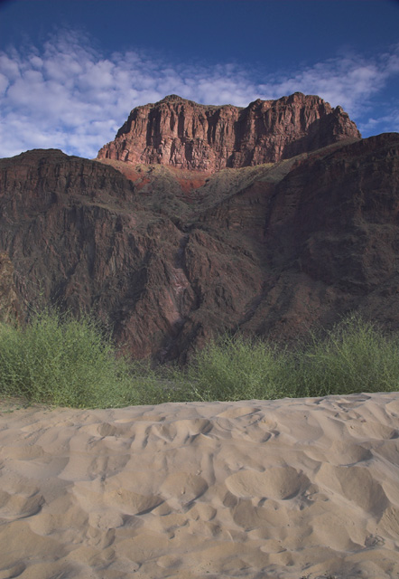
| I like how the different "layers" lead the eyes upwards and into your photo. Had there been a bit more color saturation or light/contrast, I would have scored this even higher. |
|
| Photographer found comment helpful. |
|
|
01/29/2006 12:35:20 AM |
| Needs more contrast. And it's tilted to the right a little. Nice balance between the sand, rock, and mountain however. |
|
|
|
01/28/2006 05:23:41 PM |
| There is a cloudy film over this whole image on my monitor (not a problem with the other images in this challenge) 5 |
|
|
|
01/27/2006 02:30:58 PM |
|
|
|
01/26/2006 10:58:28 PM |
Love the layers. I do think it would have been a touch more powerful if the foreground (sand) were a touch out of focus. May have given it even more depth!
TC |
|
|
|
01/26/2006 02:46:42 PM |
| this looks kinda hazy to me only in the darker tone areas uping the contrast would help it alot. |
|
| Photographer found comment helpful. |
|
|
01/26/2006 11:46:40 AM |
| It's lacking some contrast but it's a excellent picture. |
|
| Photographer found comment helpful. |
|
|
01/26/2006 05:53:58 AM |
| Strong rugged mountain here and suits the title so well... |
|
| Photographer found comment helpful. |
|
|
01/25/2006 02:44:58 PM |
| This picture seems almost to be leaning to the right? It gives a strange feeling of somehting not being quite as it should. Strange. The colours are perhaps a little too subdued and the sky a somewhat squashed. All this imo, obviously. Good luck! |
|
|
|
01/24/2006 07:57:15 PM |
| great location. the grass, rock, sand and cloud textures are quite nice. i wish the colors had a bit more pop. i wish we were looking more straight on |
|
| Photographer found comment helpful. |
|
|
01/24/2006 01:07:57 PM |
| Beautiful and visually compelling composition. Interesting tones and colors. Great work! 10 |
|
| Photographer found comment helpful. |
|
|
01/21/2006 05:48:51 PM |
the colors seem a bit dull and I'm not feeling the depth that is involved here.
Nice sky and detials on the crown of the mountiain |
|
|
|
01/20/2006 11:21:45 PM |
|
|
|
01/19/2006 11:22:46 PM |
| Very nice composition, nice capture...Colors are little dull, can be enhanced in the dark room. 7 |
|
| Photographer found comment helpful. |
|
|
01/18/2006 12:55:40 AM |
|
| Photographer found comment helpful. |
|
|
01/17/2006 10:54:31 PM |
| The colours all seem a bit washed out to me, there is no black in the photo. It is all grey. Definately needs a strong contrast boost in my opinion to get it looking richer. |
|
|
|
01/16/2006 06:37:00 PM |
| could use a little bit more contrast |
|
| Photographer found comment helpful. |
|
|
01/16/2006 12:35:52 PM |
| I like how the different areas stack on top of each other -- interesting. |
|
| Photographer found comment helpful. |
Home -
Challenges -
Community -
League -
Photos -
Cameras -
Lenses -
Learn -
Help -
Terms of Use -
Privacy -
Top ^
DPChallenge, and website content and design, Copyright © 2001-2026 Challenging Technologies, LLC.
All digital photo copyrights belong to the photographers and may not be used without permission.
Current Server Time: 02/01/2026 10:54:32 AM EST.