| Author | Thread |
|
|
01/13/2006 05:37:56 AM |
* Greetings from the Critique Club *
First Impression - the most important one:
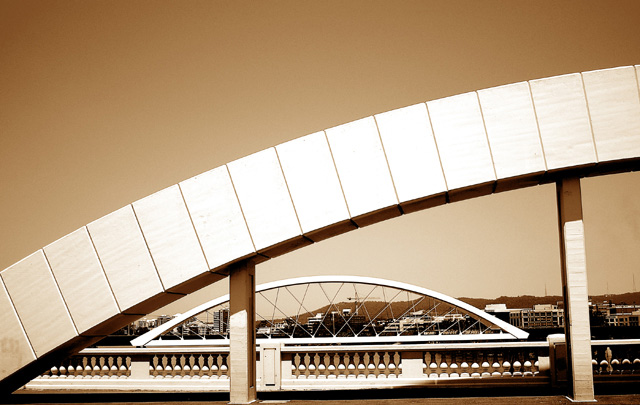
Well, I scored this an 8 during the challenge. My first impression was obviously a very positive one. With a score above 6.2, the majority of voters must have felt the same way! That being said and upon closer inspection (and after reading the other comments given), I will do my best to provide some constructive feedback. [Next time it might help the CC if you also left some photographer comments regarding your intentions, post-processing steps, etc. - Thanks!]
Composition:
Some mixed messages from commenters on your composition here. I definitely see the symmetry - nice job there. Certainly very strong shapes that compliment each other in a very visually appealing manner. My only real nit with your composition is the apparent slight tilt of the horizon. Whether or not it is actually the case, the illusion is there (at least to me and is one of the reasons I didn't score this a 10). I understand that the left-most support looks perpendicular, but the uphill slope of the wall, the slant of the right-hand support, and buildings in the background throw the rest of the shot off balance. I think with a very slight adjustment to the horizon line, this would have corrected it and increased your already high score. Otherwise, great lines, shapes, etc.
Subject:
The subject matter was right on topic and couldn't have been more relevant to the challenge theme IMHO.
Technical (Color, focus, and light):
There were some differences of opinion again with regard to some of the technical aspects of the shot. Personally, I think that your choice of tones was excellent. It strayed from the normal B/W or duotone, and added a complimentary flavor to the mood of the image. Your lighting control was especially good. I think you managed to eke out a wide range of tonal quality without going overboard at either end of the spectrum. With regard to the color and DOF, I do see that there were some people who would have preferred a different approach, but I view this as more personal taste than whether or not this particular shot was executed well.
To grow its vote?:
Little things as stated above. Personal tastes and a few minor details would have probably landed this a little higher on the scoring ladder (although there wasn't a whole lot more room for it to rise).
Summary:
Great job and I look forward to seeing more of your work.
Just my 2 cents...
Jimmy |
|
 Photographer found comment helpful. Photographer found comment helpful. |
Comments Made During the Challenge  |
|
|
01/09/2006 08:42:15 PM |
| Nice picture, but your color balance is off. There is a yellow cast on the whole photo, so your image is flat. |
|
| Photographer found comment helpful. |
|
|
01/09/2006 04:33:45 PM |
| Beautiful! Congratulations on a really nice photo. 10 from me. |
|
| Photographer found comment helpful. |
|
|
01/08/2006 01:59:08 PM |
| Wow, quite an effect you have there. Well done on the subject and the mono. Is it supposed to go uphill like that? |
|
| Photographer found comment helpful. |
|
|
01/07/2006 07:24:28 AM |
| wow. Love the composition. Draws attention right away to the multitude of shapes. One of the best I've seen so far. |
|
| Photographer found comment helpful. |
|
|
01/06/2006 01:54:58 PM |
| Effective viewpoint and color choice. |
|
| Photographer found comment helpful. |
|
|
01/06/2006 02:18:04 AM |
I don't see any symmetry inthe photograph. Horizon doesn't look level to me.
Not sure about the sepia tone eiter.
Perhaps another angle would have worked better. |
|
| Photographer found comment helpful. |
|
|
01/05/2006 03:27:48 PM |
| Good image, but it would be improved by narrowing the depth of field to blur the distracting background stuff - even if it comes at the cost of making the more distant bridge slightly blurry. |
|
| Photographer found comment helpful. |
|
|
01/05/2006 03:18:11 PM |
|
| Photographer found comment helpful. |
|
|
01/05/2006 06:16:49 AM |
| Nice image. Strong shapes. I just don't know about the toning. |
|
| Photographer found comment helpful. |
|
|
01/05/2006 04:42:36 AM |
|
| Photographer found comment helpful. |
|
|
01/04/2006 05:27:16 PM |
|
| Photographer found comment helpful. |
|
|
01/04/2006 09:07:03 AM |
| Looks slightly tilted, but it's a cool image. |
|
| Photographer found comment helpful. |
|
|
01/04/2006 04:01:07 AM |
| Just a hair too hot in the middle for my taste. Perfect composition. I love this! |
|
| Photographer found comment helpful. |
Home -
Challenges -
Community -
League -
Photos -
Cameras -
Lenses -
Learn -
Help -
Terms of Use -
Privacy -
Top ^
DPChallenge, and website content and design, Copyright © 2001-2025 Challenging Technologies, LLC.
All digital photo copyrights belong to the photographers and may not be used without permission.
Current Server Time: 04/07/2025 02:12:40 AM EDT.